Good Impressions was tasked with creating the brand and website for ProPlay Sport Events and its suite of event based products. The ProPlay Sport Events brand is dedicated to providing unique and memorable sporting experiences for children, adults, and companies. Their suite of products consist of Play on the Pitch, PropPlay 5 a-side, ProPlay Cricket, Paris International Cup and ProPlay Rugby.
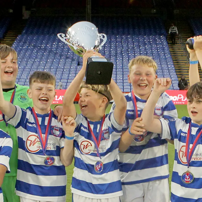
The premier product of ProPlay Sport Events is Play on the Pitch, which gives individuals and companies the opportunity to play at Premier League and Football League stadiums. Good Impressions was responsible for creating the entire brand identity for Play on the Pitch, including the logo, colour scheme, and visual elements. We wanted the brand to evoke a sense of excitement and exclusivity, while also showcasing the professional and high-quality experience that ProPlay Sport Events provides.
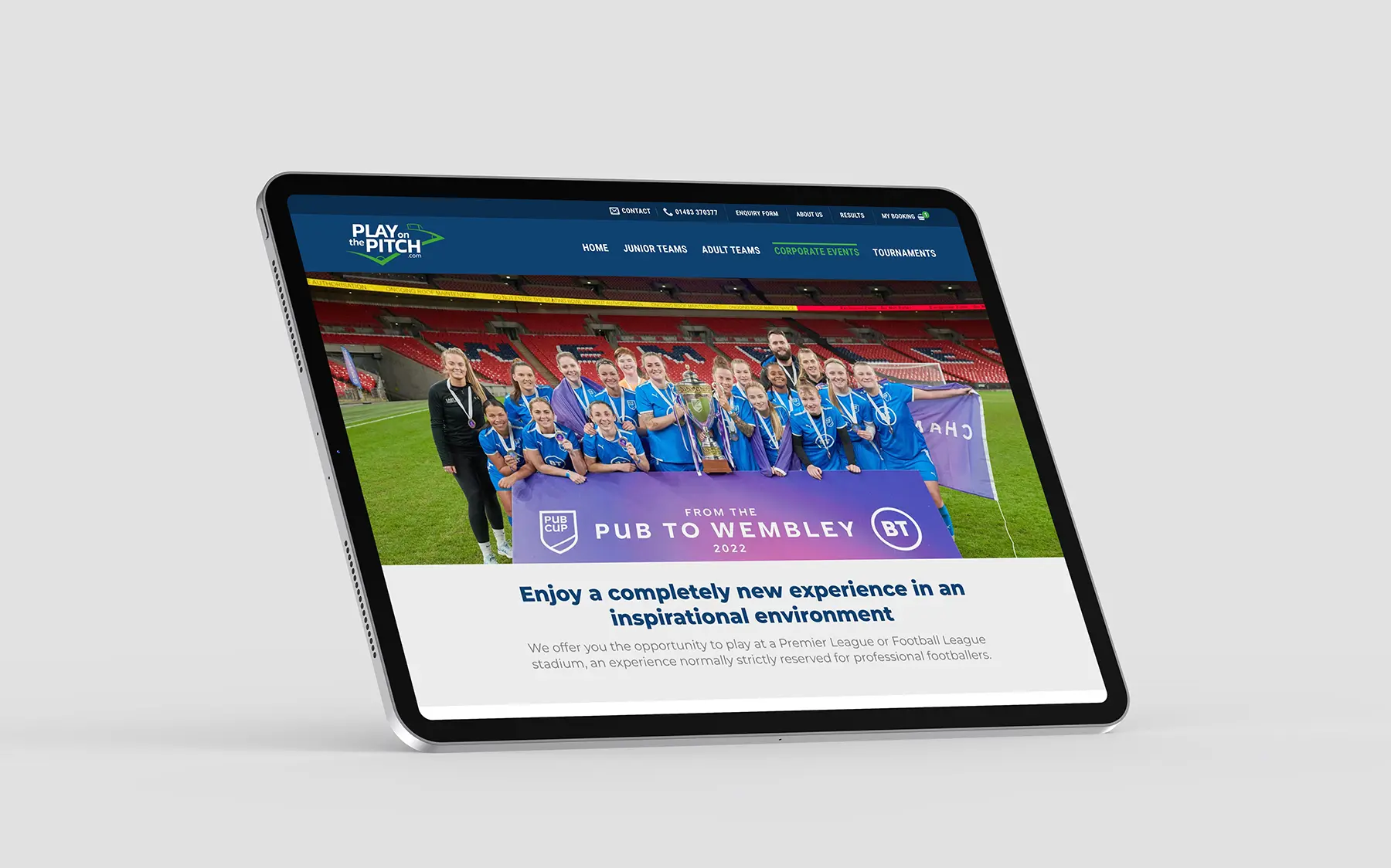
In addition to the brand identity, we also designed and developed the Play on the Pitch website. The website was built on the WordPress platform and utilised Woocommerce for its e-commerce functionality. Our goal was to create a user-friendly and visually appealing website that would showcase the various events and allow teams to easily book their spot. We included a detailed description of each event, along with pricing, dates, and availability. The website also features stunning images of the stadiums where the events take place, further highlighting the unique and prestigious nature of Play on the Pitch.
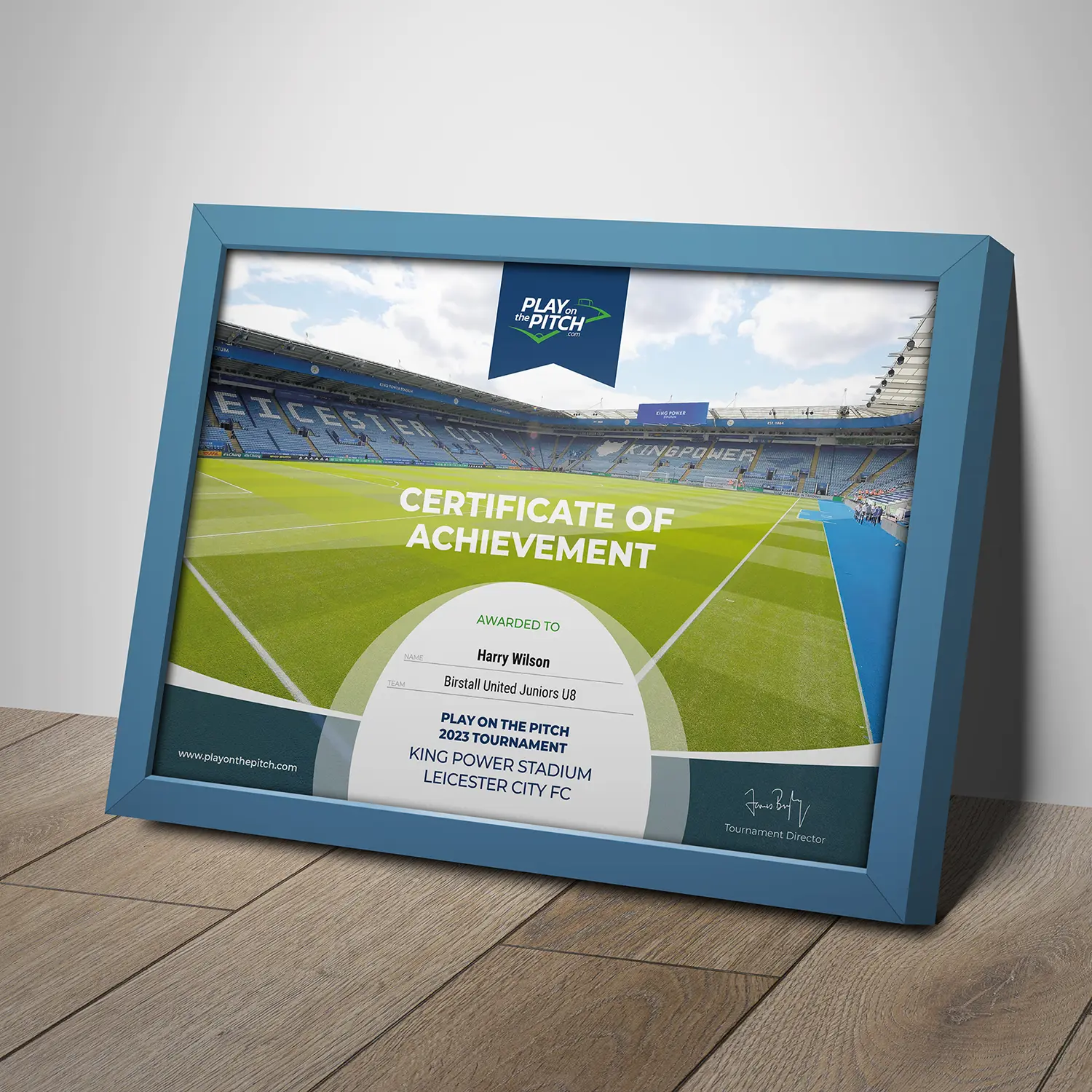
To add to the overall experience, we also designed and printed personalised certificates for each participant, as well as an event programme. These elements not only added to the professional and polished look of the events but also served as keepsakes for the participants to remember their experience.
In conclusion, Good Impressions was honoured to be a part of creating the brand and website for ProPlay Sport Events and its suite of products. The success of Play on the Pitch and the positive feedback from customers is a testament to the hard work and dedication that went into creating a strong and cohesive brand identity and a user-friendly website. We are confident that the other ProPlay Sport Events products will also be a hit with their target audience and we look forward to collaborating with them on future projects.
For the past two decades, our team at Good Impressions has had the pleasure of working with Locata Housing Services, the leading provider of social housing and homelessness software in the UK. As their long-standing supplier, we have been involved in various projects and campaigns to help promote their brand and products. However, with the ever-changing landscape of technology and design, it was time for a refresh.
One of the main requirements for the brand refresh was to create a design that reflected the modular nature of their software offering. Locata Housing Services provides a range of software solutions that can be used as standalone products or combined to create a full-service solution. Therefore, it was important for the brand to convey flexibility and versatility, while still maintaining a professional and trustworthy image.
To achieve this, we focused on creating a clean and modern design that incorporated a modular layout. This allowed for easy navigation and highlighted the different software solutions offered. We also incorporated a new palette of secondary colours that are eye-catching and add a dynamic and energetic touch.
In addition to the brand refresh, we were also tasked with designing and building a new website. The website needed to showcase why they are the UK’s leading supplier of social housing and homelessness software, their product range, and their market share. We worked closely with the team at Locata to understand their goals and target audience, and then created a website that not only looked visually appealing but also effectively conveyed their key messages.
The website features a user-friendly interface, with clear navigation and concise content that highlights the benefits of Locata’s software solutions. We also incorporated testimonials from satisfied clients to demonstrate the success of their products. The corporate logo was also updated to be used only in black or white, further emphasising the sleek and modern look of the brand.
Overall, the brand refresh and website design for Locata Housing Services was a successful collaboration between us and their team. The new brand and website effectively convey the company’s professionalism, reliability, and market-leading status. We are proud to have been a part of this project and look forward to continuing our partnership with Locata in the future.
Mandar Solutions is a company that specialises in providing innovative and cutting-edge monitoring solutions for various industries. When they approached us to help them create their brand and design and build their new website, we were excited to work with such a dynamic and forward-thinking company. Intrigued by their business, we were eager to take on this project and help bring their vision to life. From the initial meetings with their team, we knew that this was going to be a unique and exciting project.
During the design phase, we worked closely with the Mandar Solutions team to ensure that their brand and website accurately reflected their company values and mission. We wanted to create a modern and innovative look that would appeal to their target audience and stand out in their industry.
One of the key elements developed for their logo was the green section. This not only added a pop of colour to the design, but it also represented the green light found on most hardware, indicating that the device is on and working as expected.
When it came to building the website, we wanted to create a user-friendly and visually appealing experience for their customers. One of the standout features of the website is the interactive illustration that visually shows how their system monitors, alerts and responds to changes in equipped areas. This was a clever way to showcase the unique capabilities of their system and give potential customers a better understanding of how it could be deployed.
Throughout the entire process, we worked closely with the Mandar Solutions team to ensure that their brand and website accurately represented their values and mission. We also provided them with training and support on how to manage and update their website, giving them control and flexibility to make changes as their business grows.
In the end, we were proud to deliver a brand and website that surpassed their expectations. Their brand now stands out in their industry, and their website effectively showcases their services and capabilities. It was a pleasure working with Mandar Solutions, and we look forward to continuing to support them as their business continues to thrive.
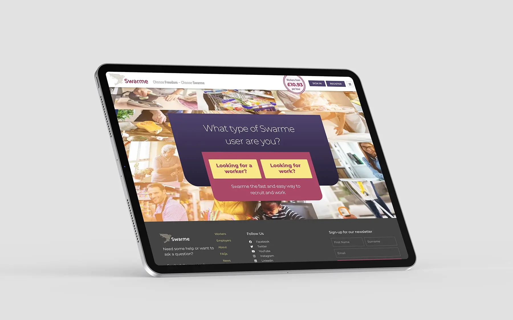
We were delighted to have the opportunity to work with Swarme, a revolutionary recruitment company that has taken a unique marketplace approach to connecting workers with employers. From the very beginning, we were impressed by their vision and passion for creating a more efficient and transparent way of hiring and finding work. Our team was eager to help bring their ideas to life and create a user-friendly website that would complement and promote their cross-platform app.
One of the first steps in the design process was to fully understand Swarme’s business model and target audience. We worked closely with their team to gain a deep understanding of their marketplace approach and how it differs from traditional recruitment methods. This helped us to identify key features and functionalities that would be essential for their website, such as a direct entry point for both workers and employers, a job board and worker profiles.
Another important aspect of the project was ensuring that the website was fully responsive and optimised for all devices. With Swarme’s target audience consisting of both workers and employers who may be on-the-go, it was crucial that the website was easily accessible and functional on mobile devices. Our team worked diligently to ensure that the website not only looked great on all devices but also provided a seamless user experience.
The integration with their website with their cross-platform app would allow for a seamless experience funnelling users to the main platform. We worked closely with the Swarme team to ensure that the design and branding of the website were consistent with their app, creating a cohesive and recognisable brand identity.
Throughout the design and development process, we collaborated closely with the Swarme team, providing regular updates and incorporating their feedback to ensure that the end result met their expectations. We also conducted thorough testing to ensure that the website was functioning smoothly and efficiently.
In the end, we were proud to deliver a modern and user-friendly website that effectively showcased Swarme’s unique marketplace approach to recruitment. The website not only complemented their cross-platform app but also helped to promote it, attracting more users and increasing their visibility in the market. It was a pleasure to work with such a forward-thinking and innovative company and we look forward to seeing the impact that Swarme will continue to make in the world of recruitment.
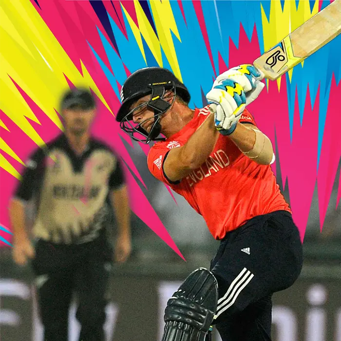
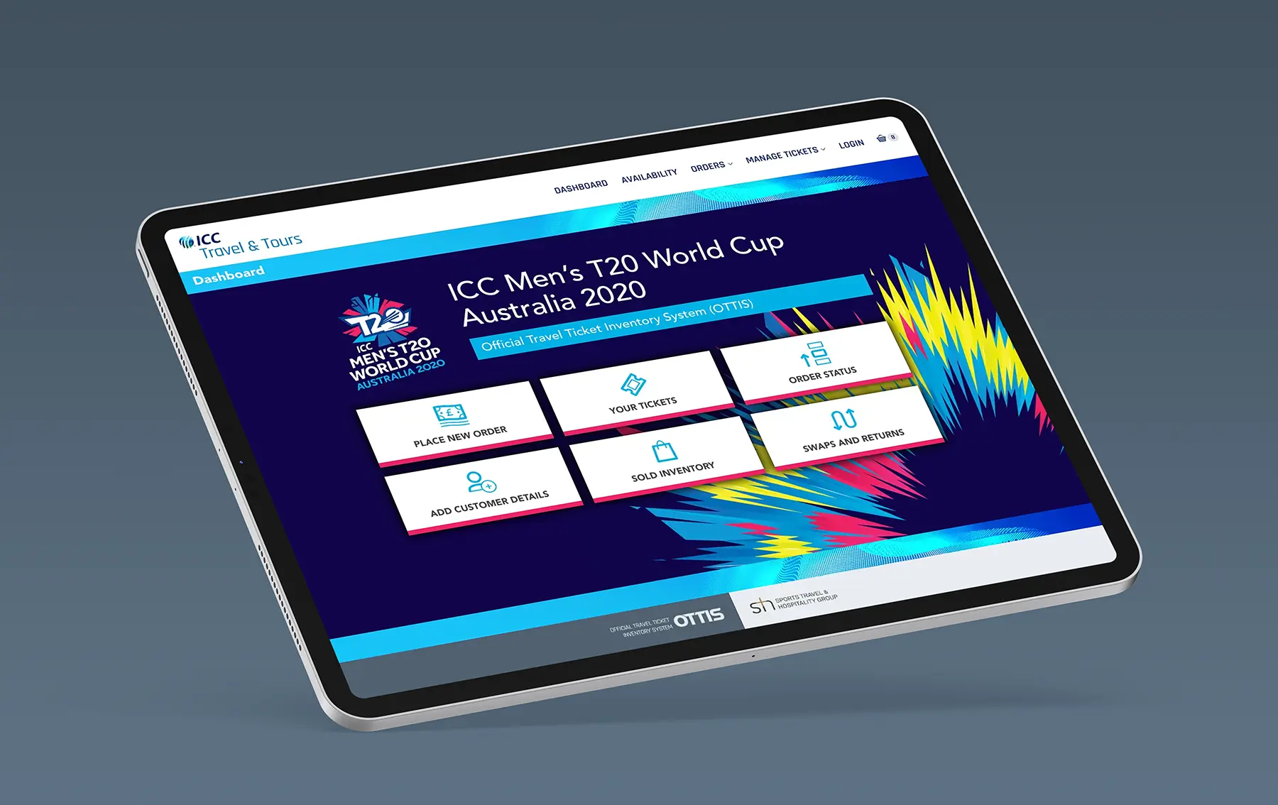
We were pleased to receive the project of designing a ticketing website for the upcoming ICC T20 World Cup 2020 in Australia. The task at hand was no small feat, as the website needed to not only represent the prestigious International Cricket Council (ICC) but also incorporate the branding of T20, a fast-paced and exciting form of the game. Our goal was to create a visually appealing and user-friendly website that would serve as the go-to platform for fans to purchase tickets for the highly anticipated tournament.
We began by conducting thorough research on both the ICC and T20 branding guidelines to ensure that our design would accurately reflect their identities. We also took into consideration the target audience, which would primarily consist of cricket enthusiasts from all over the world. This meant that the website needed to be accessible and easy to navigate for both local and international users.
The key pages of the website included the dashboard, ticket ordering, swaps and returns pages. For the dashboard, we wanted to create a dynamic and vibrant design that would immediately capture the attention of visitors. We incorporated elements from both the ICC and T20 branding to establish a cohesive look. The ticket ordering page was designed to be functional and informative, with a clean layout that displayed all the important match information and package options available.
We opted to develop the design using WordPress as this allowed us to quickly build responsive pages and templates that could easily be relocated to the bespoke CMS and eCommerce system that would manage the operation.
The end result was a visually stunning and functional website that served as the primary platform for fans to purchase tickets for the ICC T20 World Cup 2020 in Australia.
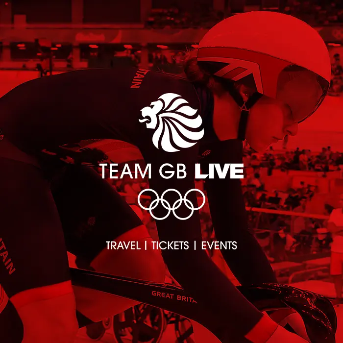
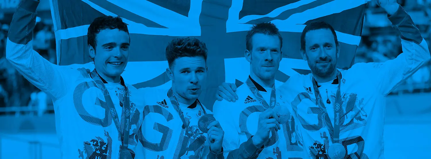
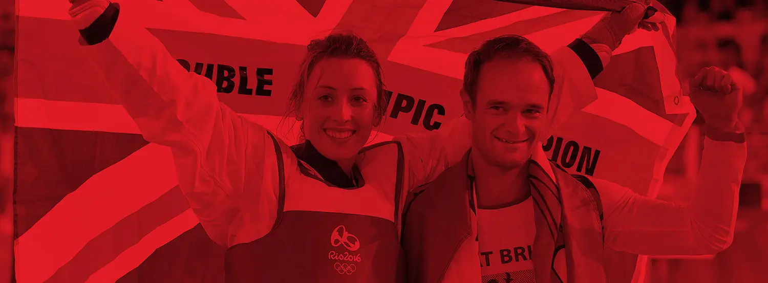
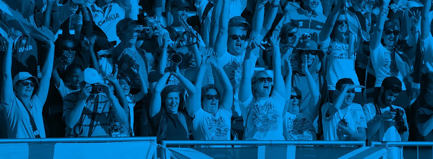
We were thrilled and honoured to have been given the opportunity to design the Team GB Live Tokyo 2020 Olympics ticketing website. As a team of experienced web designers and developers, we were excited to take on the challenge of creating a website that would not only showcase the Olympics but also provide a seamless and user-friendly ticket purchasing experience for fans.
Our first step was to thoroughly understand the brand guidelines of Team GB. This was crucial in ensuring that the website accurately reflected the values and identity of the team. We carefully studied the colors, fonts, and overall aesthetic of the brand to incorporate them into our design. We wanted the website to not only be functional but also visually appealing and representative of the Olympic spirit.
Using WordPress as our primary platform, we began creating key pages and templates that would be essential for the website. These included the homepage, event pages, ticket purchasing pages, and information pages. Each page was designed with a mobile-first approach, ensuring that the website would be fully responsive and accessible on all devices. Various features were integrated such as a countdown timer to build anticipation for the games and a map to help users navigate the different venues.
After completing the designs, they were seamlessly integrated into a bespoke CMS and eCommerce system. This allowed the introduction of specific functionality, easy management of content and ticket sales, making the process efficient for both the team and the users. Various security measures were incorporated to ensure a safe and secure online ticket purchasing experience.
However, just as we were nearing the launch of the website, the unfortunate news of the Olympic Games being delayed by a year due to the pandemic was announced. This meant that the website would not be used as the games ended up being held behind closed doors. While we were very disappointed, prioritising public health and safety was paramount.
Nevertheless, we were proud of the website we had designed and the opportunity to be a part of such a prestigious event.
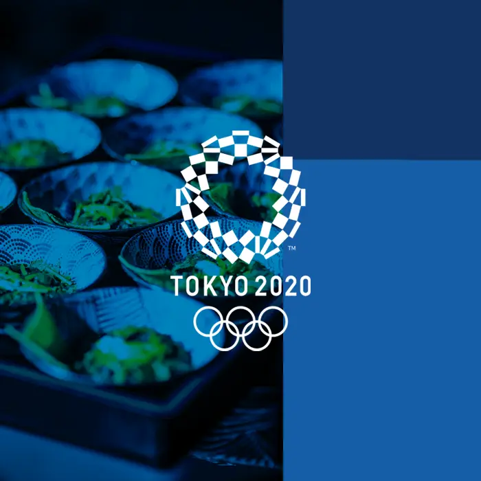
The Tokyo 2020 Olympic and Paralympic Games were highly anticipated events that were set to be held in Japan. Working with STH, the official hospitality partner for the games, our team was tasked with creating a multilingual hospitality website adhering to strict brand guidelines, that would cater to the needs of both local and international visitors.
The project began with extensive research on the cultural and linguistic diversity of potential visitors to the games. We wanted to ensure that the website would be user-friendly and accessible to people from all around the world. This involved collaborating with language experts and cultural consultants to accurately represent the various languages and cultures on the website.
One of the main challenges we faced was the unexpected delay of the games by a year due to the global pandemic. This meant that our team had to adapt quickly and make necessary changes to the website to reflect the new dates. It was a race against time as we had to make sure that all the information on the website was up-to-date and accurate, while also keeping in mind the ever-evolving situation of the pandemic.
Despite the challenges, our team worked tirelessly to create a visually appealing and informative website that would serve visitors wanting to purchase hospitality tickets to the games. The website featured detailed information on the games, including the schedule, venues, ticketing, and transportation. We also included a section on Japanese culture, highlighting the country’s unique customs and traditions, to help visitors better understand and appreciate their experience.
As we were nearing the launch date we received the unfortunate news the games were going to be delayed by a year due to the global pandemic. In the end the website was not used due to the unprecedented decision to hold the games behind closed doors.
In conclusion, building the multilingual Tokyo 2020 hospitality website was a challenging yet fulfilling experience. Despite the unexpected delay and disappointing change in circumstances, our team worked tirelessly to create a website that would have enhanced the overall experience for visitors to the games. While it was not utilised, we are proud of the website we created and the opportunity to showcase Japan’s warm hospitality to the world.
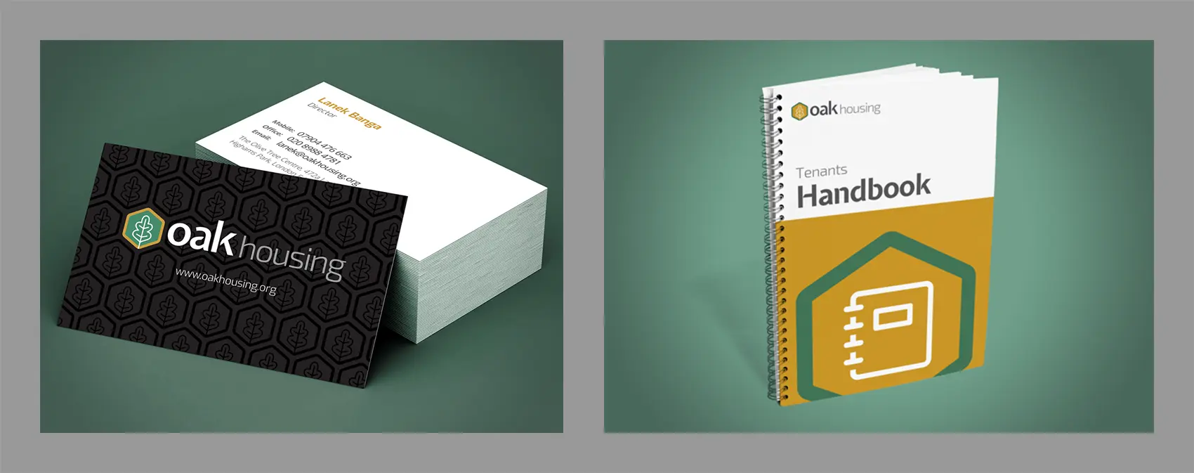
Oak Housing Limited was set up in July 2012 by Theori Investments Limited, one of the largest private sector providers of temporary accommodation in the country and are framework partners to over 20 Local Authorities in London and the South East.
It was set up to offer affordable housing options that go beyond the range of housing provided by Theori. Upon their inception we were commissioned to create a brand to encompass their stationery, handbooks and a new website.
The responsive website allows them to effectively communicate with their tenants and landlords, dealt with enquiries and respond to repair requests.
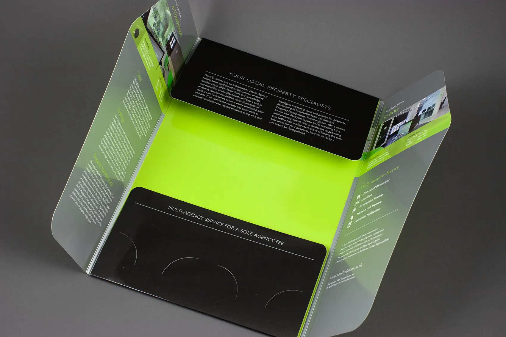
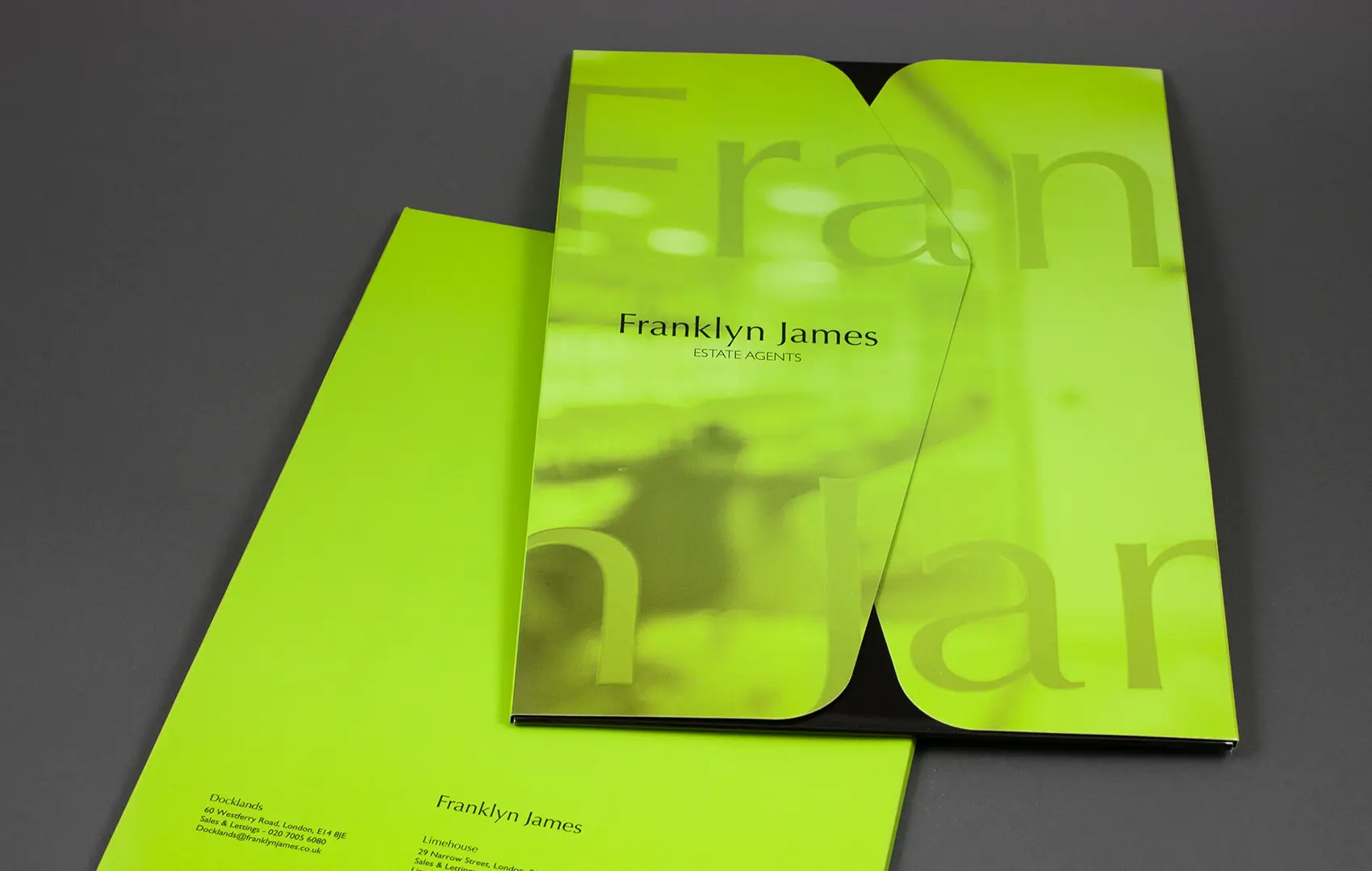
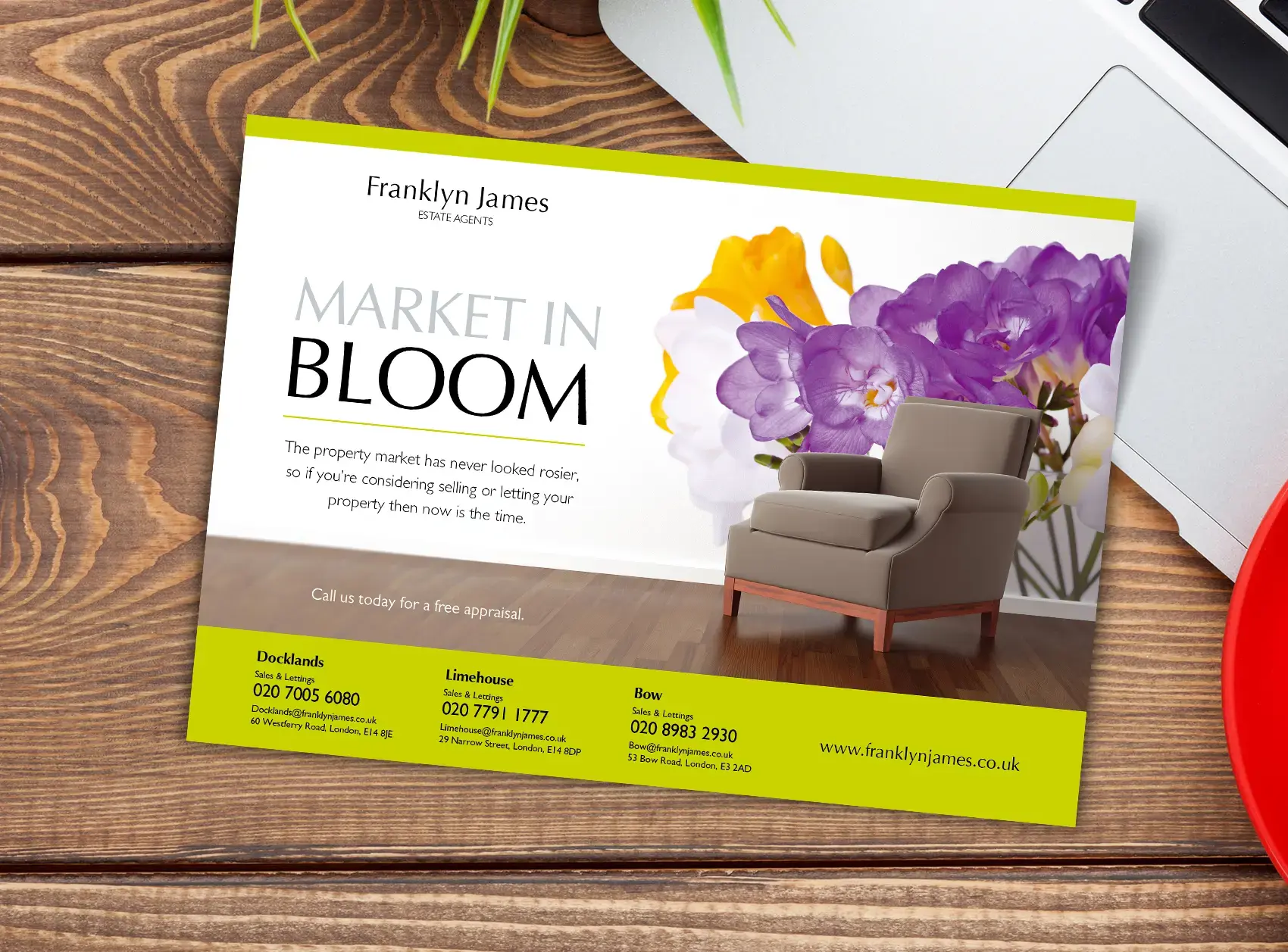
Franklyn James Estate Agents approached us wanting to improve how properties were presented to their clients and to create awareness of the company’s three offices and the services they provide.
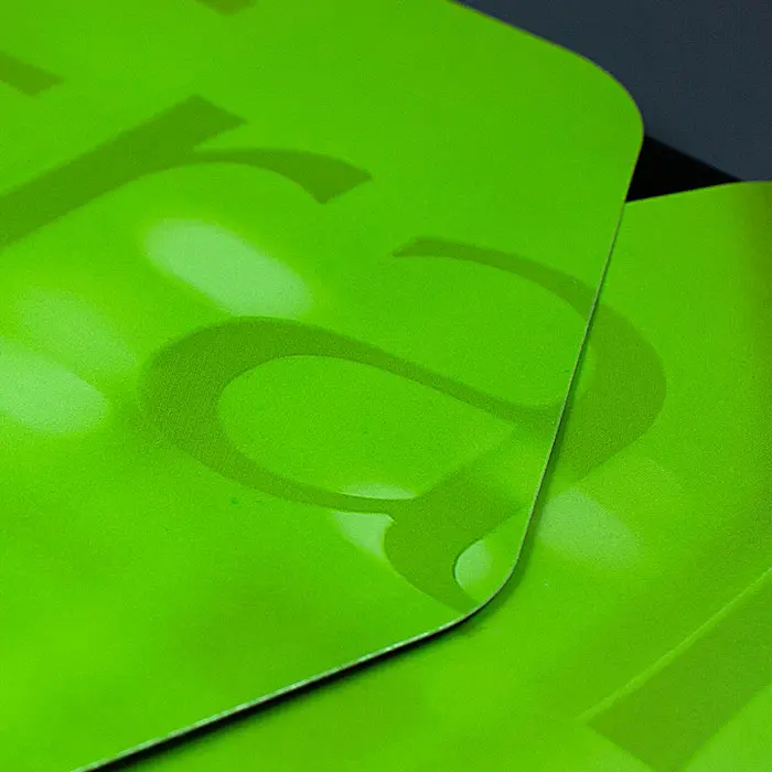
We designed a bespoke presenter which had to be of a suitable style and quality to promote the multi-million pound properties which they market. Overlaying a cover of their corporate green with a monotone image from within their docklands office, adding a metallic silver fifth colour, gloss lamination to both sides and a magnetic locking system all complete the desired look and feel of this sophisticated and eye catching document presenter.
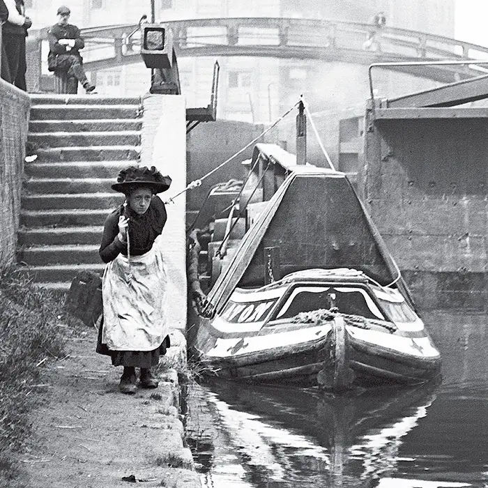
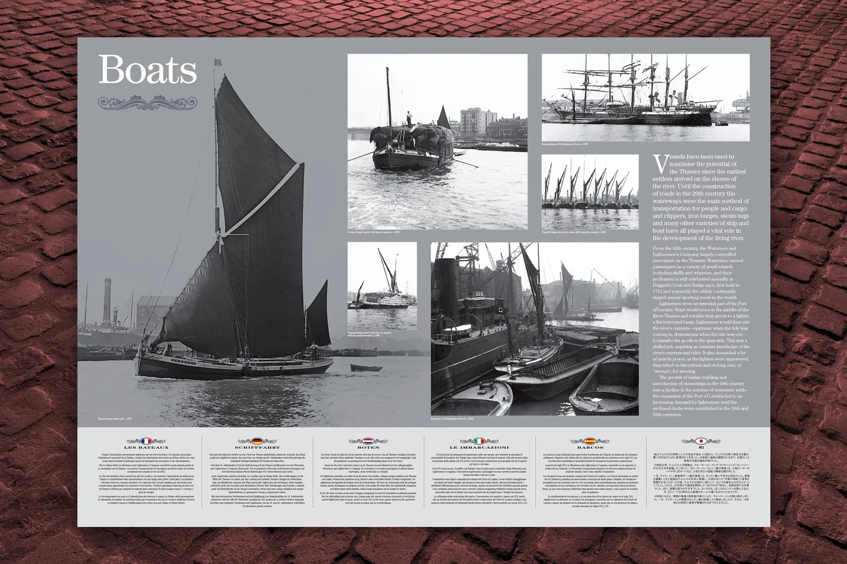
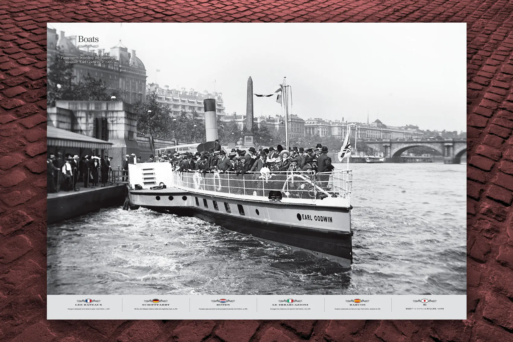
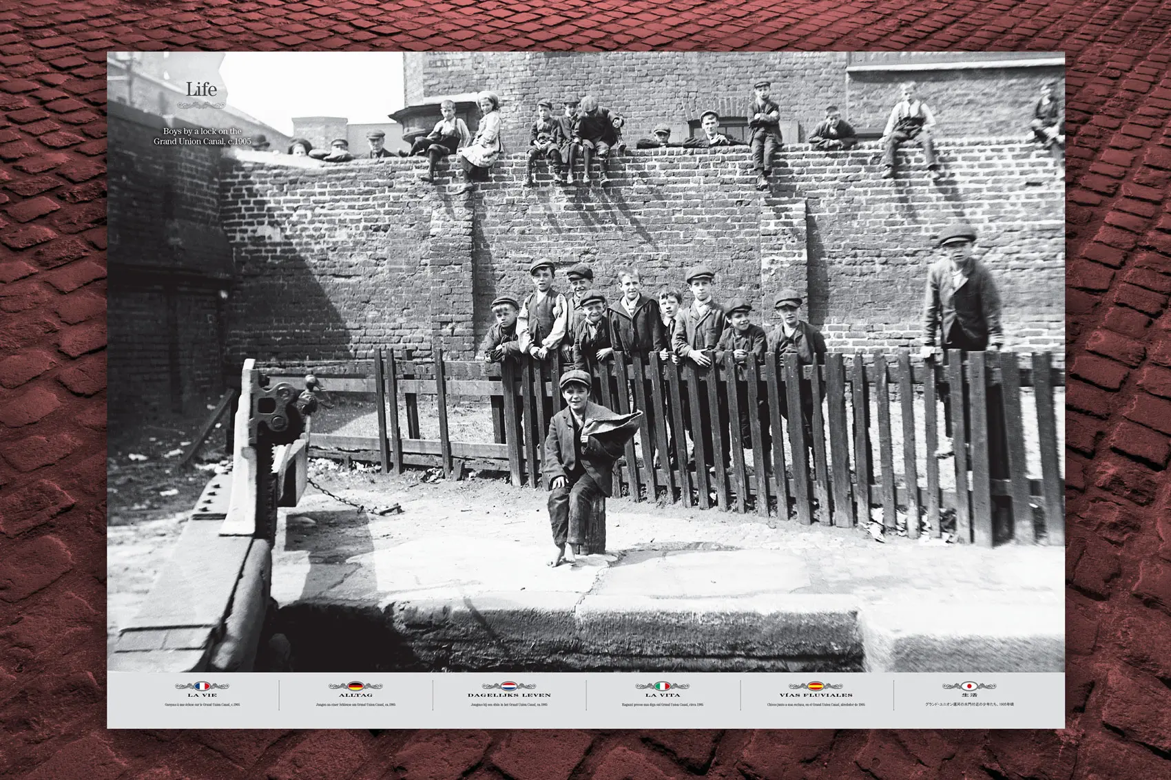
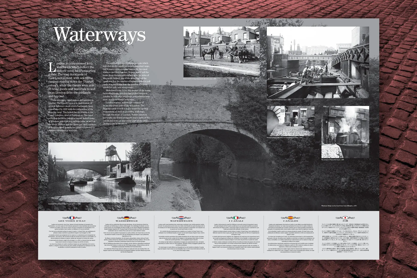
We were pleased to be asked by Tower Bridge Exhibition to design and produce their London in Black & White exhibit which was displayed in the West Walkway of the bridge.
The images were supplied by the London Metropolitan Archives and offered visitors the chance to step back in time as far back as the late 1800s and immerse themselves in the rich seam of history that surrounds Tower Bridge, the Pool of London and the surrounding areas. The exhibition of 32 panels gave accounts on boats, buildings, life, waterways and Tower Bridge.