Surrey Hills Home Cinema thumbnail

Surrey Hills Home Cinema website

Surrey Hills Home Cinema website

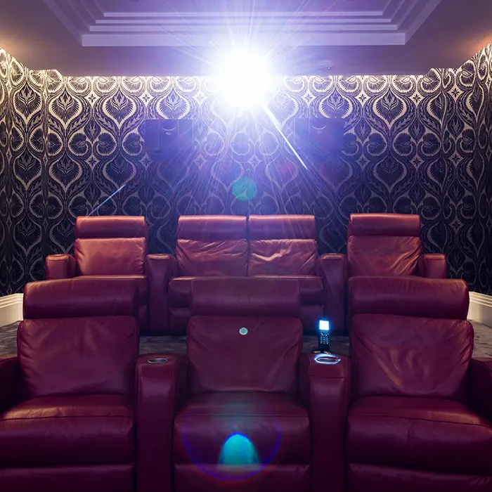
Surrey Hills Home Cinema is a company that has been in the business of creating bespoke cinema rooms for over 15 years. With their expertise and dedication to providing the ultimate cinema experience, they have built a strong reputation in the industry. However, they realised that in order to reach a wider audience and showcase their unique services, they needed a strong online presence. That’s when they approached us to design and build a new WordPress website for them. 

From the initial consultation, it was clear that Surrey Hills Home Cinema had a clear vision of what they wanted their website to achieve. They wanted a platform that would not only showcase their various projects but also educate potential clients on the process of building a home cinema. They also wanted the website to reflect their brand image of luxury, elegance, and attention to detail.

To achieve this, our team worked closely with the Surrey Hills Home Cinema team to understand their brand and their target audience. We conducted extensive research on the home cinema industry and analysed the websites of their competitors to identify areas where we could improve and stand out.

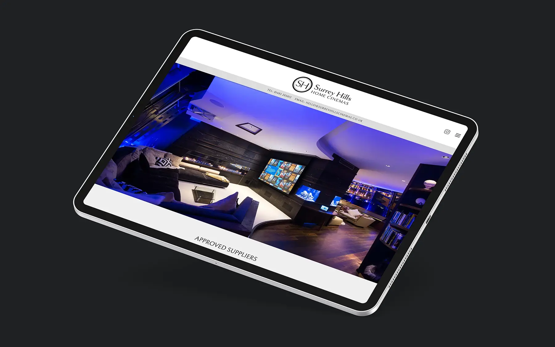
The design process began with creating a modern and visually appealing layout that would capture the attention of visitors. We incorporated high-quality images of their previous projects and used a monochrome palette to let the imagery provide the impact. The website also featured a user-friendly interface with easy navigation, making it easy for potential clients to browse through different sections and gather information.

However, the focus of the website was not only on aesthetics but also on functionality. An informative breakdown of their services, from the type of furniture, fabrics, lighting, and carpets to the screens, projectors, speakers and controllers they use to create the ultimate cinema experience was outlined. We also included a portfolio section to showcase their previous projects that provides a gallery and detailed specification of the installation.

Working with Surrey Hills Home Cinema was a collaborative and exciting experience for our team. We were able to bring their vision to life and create a website that not only showcases their services but also educates and engages potential clients. The new website has received positive feedback from both their team and clients, and we are proud to have played a part in their continued success in the home cinema industry.

CLIENT:

Surrey Hills Home Cinema

DISCIPLINES:

WEBSITE DESIGN AND BUILD

SHARE
Surrey Hills Cinemas home page iPad

Move cursor over the image

Surrey Hills Cinemas home page iPad
Touch the image

Surrey Hills Home Cinema website Read More »

Axis website thumbnail

Axis website

Axis website

When Axis Commercial Finance approached us to help develop their brand and create their website, we were excited to take on the challenge. As a financial company, they wanted to establish a strong online presence, but they were lacking in content and were unsure of how to effectively present their services and values to potential clients. We understood the importance of a strong brand and website in the competitive financial industry and we were determined to help them stand out. 

Our first step was to conduct thorough research on the company, their target audience and their competitors. This helped us gain a deep understanding of their brand and what sets them apart from others in the market. We then worked closely with the team at Axis Commercial Finance to define their brand identity, including their mission, vision, and values. This helped us create a cohesive and consistent brand image that would resonate with their target audience.

Next, we focused on creating the website. However, due to the limited content available, we decided to take the approach of building a single-page site. This meant that all the necessary information would be presented on one page, with the menu items scrolling to different sections within the page. This not only allowed us to effectively showcase their services, but it also made for a more user-friendly experience for visitors.

After a few rounds of revisions and fine-tuning, the website was complete. The final result was a sleek, modern, and user-friendly site that effectively showcased their brand and services. We are confident that this website will serve as a valuable tool for Axis Commercial Finance to connect with their audience and grow their business. 

CLIENT:

Axis Commercial Finance Limited

DISCIPLINES:

BRANDING, WEBSITE DESIGN AND BUILD

SHARE

Move cursor over the image

Touch the image

Axis website Read More »

My Advice Gateway website thumbnail

My Advice Gateway website

My Advice Gateway website

My Advice Gateway is a vital platform for individuals who are seeking guidance and support in claiming benefits, finding job opportunities, and accessing helpful resources. However, the previous website for this organisation was outdated and not user-friendly, which made it difficult for users to navigate and access the information they needed. We were approached by My Advice Gateway to create a new website that would better serve their users and fulfil their mission of providing easy access to important resources. 

The first step in this project was to understand their needs and goals. We conducted thorough research on the organisation, its target audience, and the services it offers. This helped us gain a better understanding of their vision and what they wanted to achieve with their new website. We also analysed their previous website and identified the areas that needed improvement.

After gathering all the necessary information, we proposed a solution that would best suit their requirements. We suggested rebuilding the website using the WordPress platform. WordPress is a popular and user-friendly content management system that would make it easier for them to manage their website and update content regularly.

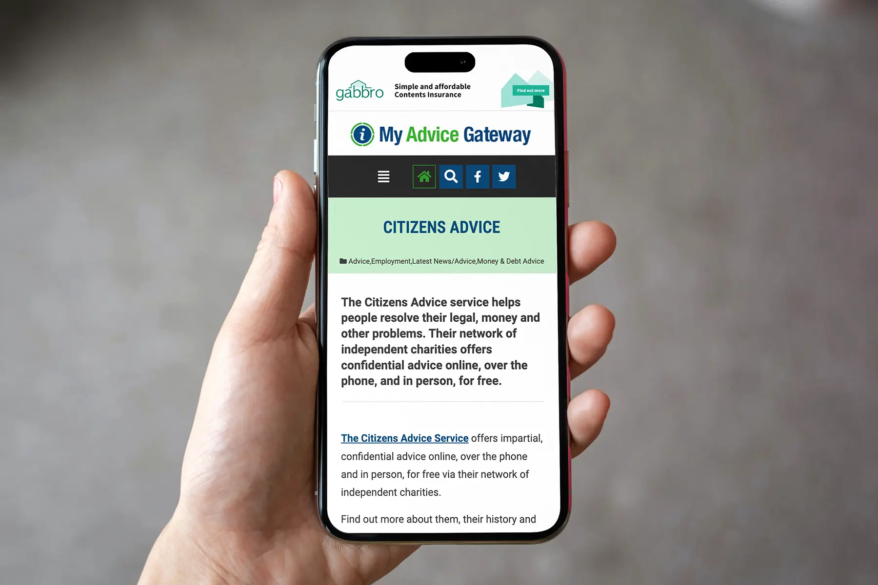
Our team worked closely with My Advice Gateway to design a website that was visually appealing, easy to navigate and aligned with their brand image. We incorporated a clean and modern design with intuitive navigation to ensure that users could easily find the information they needed. We also made sure the website was accessible and responsive, meaning it would function seamlessly on all devices, including desktops, laptops, tablets, and smartphones.

Throughout the development process, we provided regular updates and implemented their feedback. We also provided training to their team on how to manage the website and update content.

The new website was launched successfully, and the organisation saw an increase in traffic and engagement from users. The user-friendly interface and optimised content made it easier for individuals to find the help and support they needed and was able to fulfil its mission of providing a free resource for those in need.

In conclusion, our partnership with My Advice Gateway was a successful one, and we are proud to have helped them create a new website that better serves their users. We are confident that with this new platform, My Advice Gateway will continue to make a positive impact on individuals seeking guidance and support in claiming benefits, finding job opportunities and accessing helpful resources. 

CLIENT:

My Advice Gateway

DISCIPLINES:

WEBSITE DESIGN AND BUILD

SHARE

Move cursor over the image

My Advice Gateway website story page mobile
Touch the image
My Advice Gateway website story page mobile

My Advice Gateway website Read More »

WEC Nuclear Scenarios thumbnail

WEC Nuclear Scenarios Report

WEC Nuclear Scenarios Report

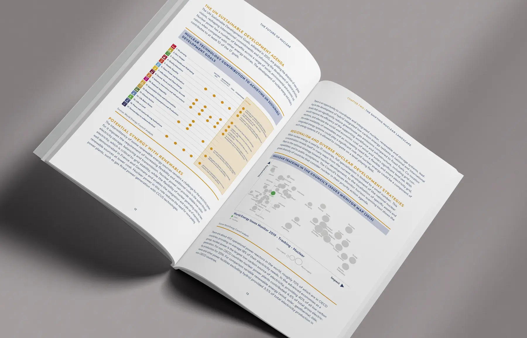
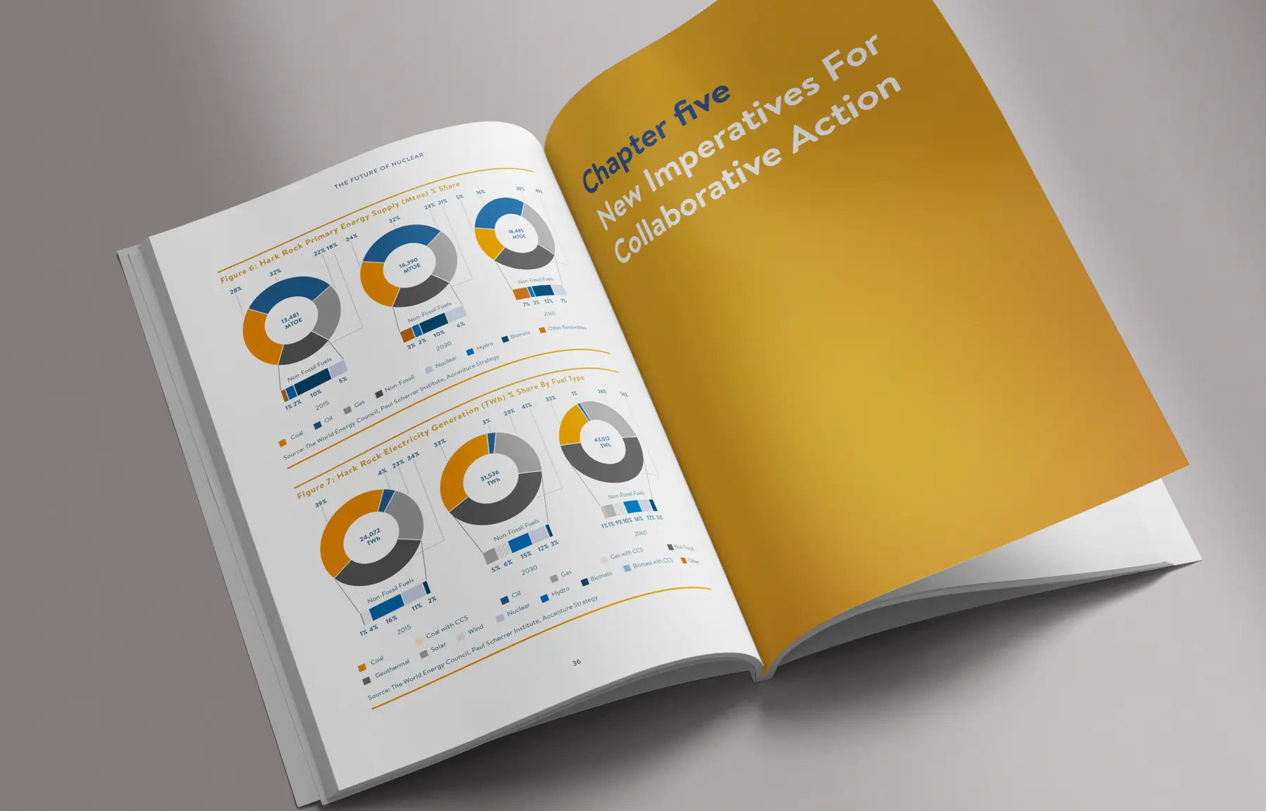
When the World Energy Council approached us to design their Nuclear Scenarios report, we were very pleased for the opportunity. Up to now we had only been supplying printing services, but for this project, we were tasked with creating the entire report and summary document. This was an exciting challenge for us, as it allowed us to showcase our skills and work closely with the WEC to bring their vision to life. 

The first step in the design process was familiarising ourselves with the World Energy Council’s brand guidelines. As a reputable and well-established organisation, it was crucial for us to adhere to their branding in order to maintain consistency and credibility.

The report was a comprehensive 66 pages, filled with data, charts and graphs. Our team of designers worked closely with the WEC to organise the information in a visually appealing and easy-to-understand format. Infographics and visually striking charts to make the information more engaging and digestible for the readers.

The summary document, on the other hand, was a condensed version of the report, consisting of only 4 pages. Our challenge was to convey the key points and findings of the report in a concise and impactful manner.

Throughout the design process, we collaborated closely with the World Energy Council to ensure that the final product met their expectations and accurately represented their research and findings.

In the end, we were immensely proud of the final result. The Nuclear Scenarios report and summary document were not only visually appealing but also effectively communicated the WEC’s insights and recommendations. It was an honour to be a part of this project and we look forward to future collaborations. 

CLIENT:

World Energy Council

DISCIPLINES:

Graphic Design

SHARE
WEC Nuclear Scenarios p36 & p37
WEC Nuclear Scenarios p36 & p37WEC Nuclear Scenarios p36 & p37
WEC Nuclear Scenarios p36 & p37
WEC Nuclear Scenarios p36 & p37WEC Nuclear Scenarios p36 & p37

WEC Nuclear Scenarios Report Read More »

Play on the Pitch website thumbnail

Play on the Pitch

Play on the Pitch

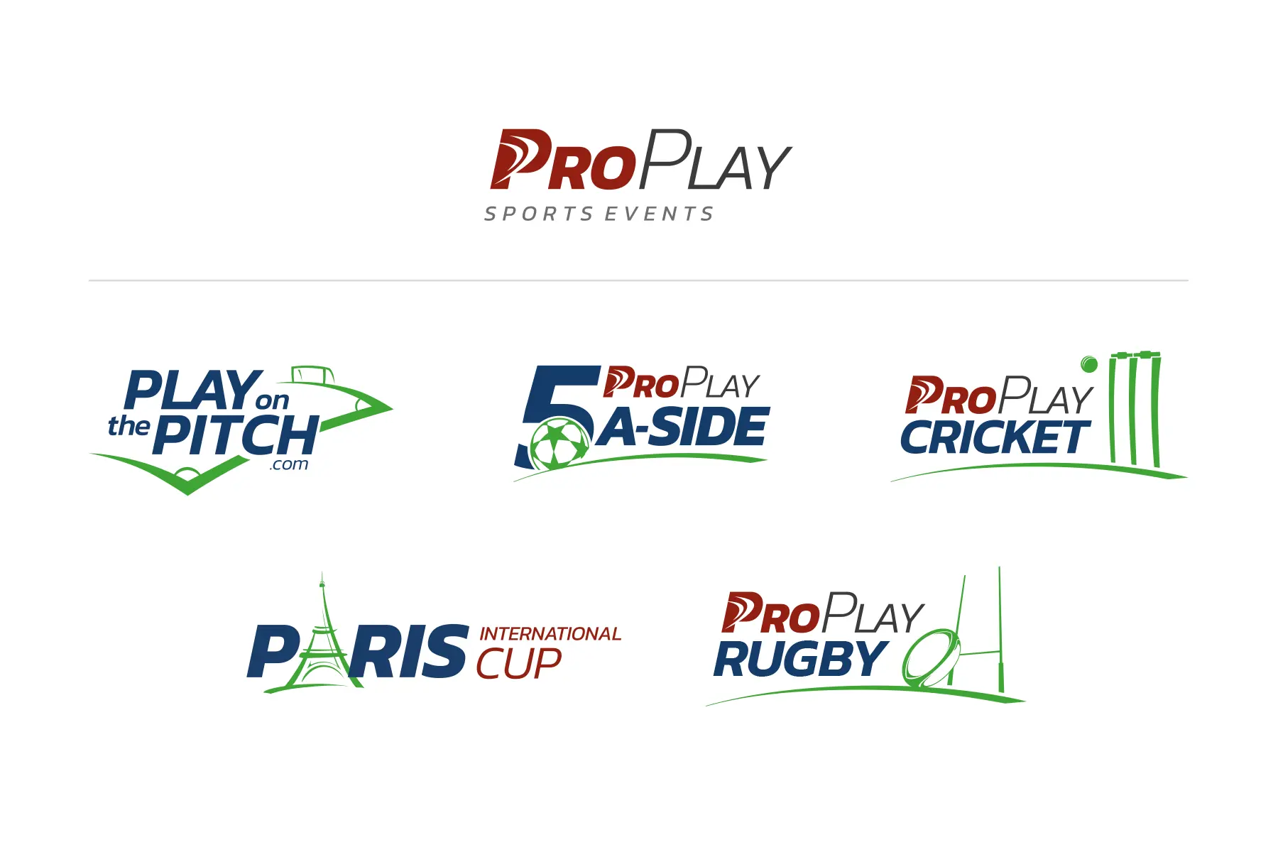
Good Impressions was tasked with creating the brand and website for ProPlay Sport Events and its suite of event based products. The ProPlay Sport Events brand is dedicated to providing unique and memorable sporting experiences for children, adults, and companies. Their suite of products consist of Play on the Pitch, PropPlay 5 a-side, ProPlay Cricket, Paris International Cup and ProPlay Rugby. 

The premier product of ProPlay Sport Events is Play on the Pitch, which gives individuals and companies the opportunity to play at Premier League and Football League stadiums. Good Impressions was responsible for creating the entire brand identity for Play on the Pitch, including the logo, colour scheme, and visual elements. We wanted the brand to evoke a sense of excitement and exclusivity, while also showcasing the professional and high-quality experience that ProPlay Sport Events provides.

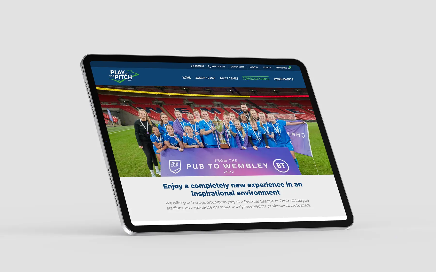
In addition to the brand identity, we also designed and developed the Play on the Pitch website. The website was built on the WordPress platform and utilised Woocommerce for its e-commerce functionality. Our goal was to create a user-friendly and visually appealing website that would showcase the various events and allow teams to easily book their spot. We included a detailed description of each event, along with pricing, dates, and availability. The website also features stunning images of the stadiums where the events take place, further highlighting the unique and prestigious nature of Play on the Pitch.

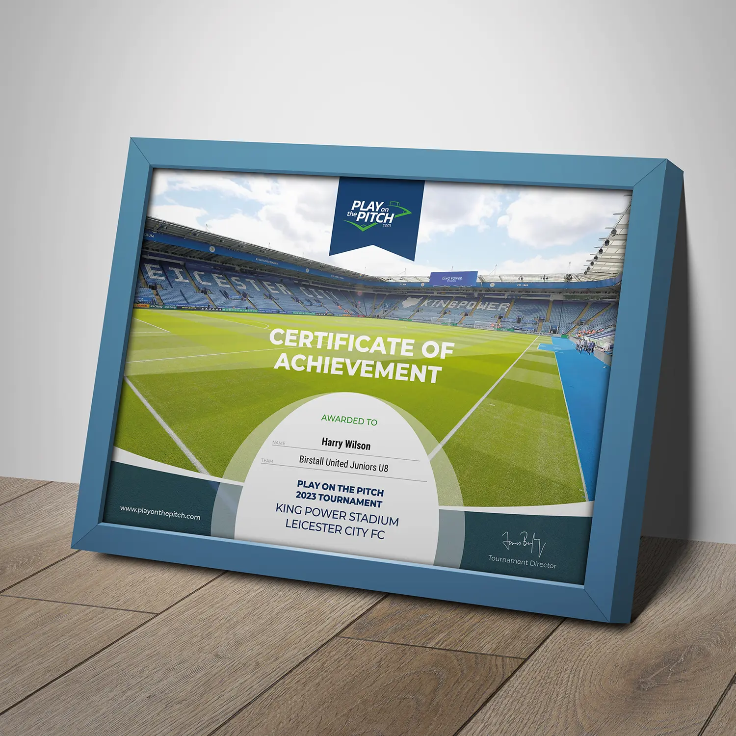
To add to the overall experience, we also designed and printed personalised certificates for each participant, as well as an event programme. These elements not only added to the professional and polished look of the events but also served as keepsakes for the participants to remember their experience.

In conclusion, Good Impressions was honoured to be a part of creating the brand and website for ProPlay Sport Events and its suite of products. The success of Play on the Pitch and the positive feedback from customers is a testament to the hard work and dedication that went into creating a strong and cohesive brand identity and a user-friendly website. We are confident that the other ProPlay Sport Events products will also be a hit with their target audience and we look forward to collaborating with them on future projects. 

CLIENT:

Locata Housing Services

DISCIPLINES:

Branding, WEBSITE DESIGN AND BUILD

SHARE
ProPlay logo family

Move cursor over the image

Play on the Pitch corporate page on iPad Pro

LED Scoreboard template

Play on the Pitch certificate
ProPlay logo family
Touch the image
Play on the Pitch corporate page on iPad Pro

LED Scoreboard template

Play on the Pitch certificate

Play on the Pitch Read More »

Locata website thumbnail

Locata Brand Refresh and Website

Locata Brand Refresh and Website

For the past two decades, our team at Good Impressions has had the pleasure of working with Locata Housing Services, the leading provider of social housing and homelessness software in the UK. As their long-standing supplier, we have been involved in various projects and campaigns to help promote their brand and products. However, with the ever-changing landscape of technology and design, it was time for a refresh. 

One of the main requirements for the brand refresh was to create a design that reflected the modular nature of their software offering. Locata Housing Services provides a range of software solutions that can be used as standalone products or combined to create a full-service solution. Therefore, it was important for the brand to convey flexibility and versatility, while still maintaining a professional and trustworthy image.

To achieve this, we focused on creating a clean and modern design that incorporated a modular layout. This allowed for easy navigation and highlighted the different software solutions offered. We also incorporated a new palette of secondary colours that are eye-catching and add a dynamic and energetic touch.

In addition to the brand refresh, we were also tasked with designing and building a new website. The website needed to showcase why they are the UK’s leading supplier of social housing and homelessness software, their product range, and their market share. We worked closely with the team at Locata to understand their goals and target audience, and then created a website that not only looked visually appealing but also effectively conveyed their key messages.

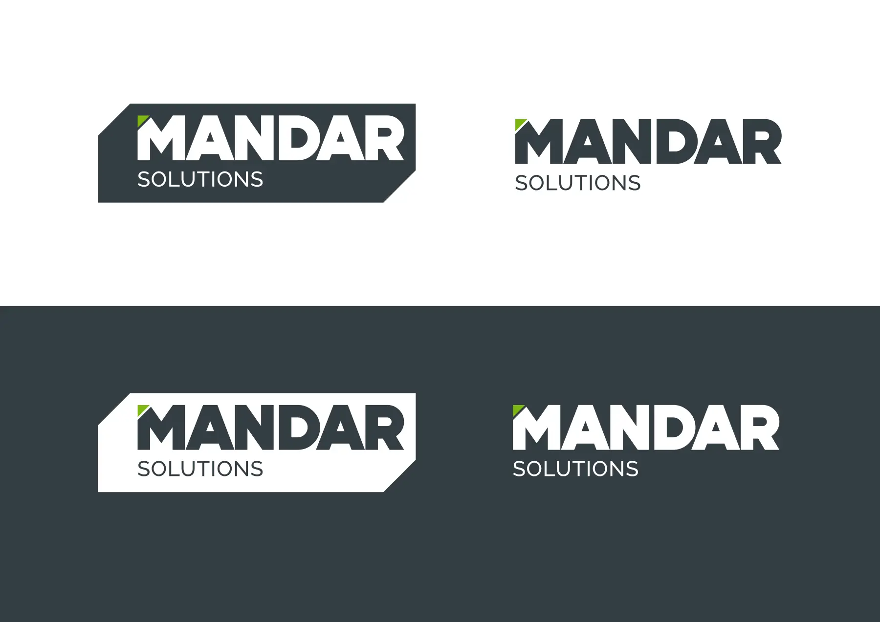
The website features a user-friendly interface, with clear navigation and concise content that highlights the benefits of Locata’s software solutions. We also incorporated testimonials from satisfied clients to demonstrate the success of their products. The corporate logo was also updated to be used only in black or white, further emphasising the sleek and modern look of the brand.

Overall, the brand refresh and website design for Locata Housing Services was a successful collaboration between us and their team. The new brand and website effectively convey the company’s professionalism, reliability, and market-leading status. We are proud to have been a part of this project and look forward to continuing our partnership with Locata in the future. 

CLIENT:

Locata Housing Services

DISCIPLINES:

Branding, WEBSITE DESIGN AND BUILD

SHARE

Move cursor over the image

Touch the image

Locata Brand Refresh and Website Read More »

Mandar thumbnail

Mandar Solutions Brand and Website

Mandar Solutions Brand and Website

Mandar Solutions is a company that specialises in providing innovative and cutting-edge monitoring solutions for various industries. When they approached us to help them create their brand and design and build their new website, we were excited to work with such a dynamic and forward-thinking company. Intrigued by their business, we were eager to take on this project and help bring their vision to life. From the initial meetings with their team, we knew that this was going to be a unique and exciting project. 

During the design phase, we worked closely with the Mandar Solutions team to ensure that their brand and website accurately reflected their company values and mission. We wanted to create a modern and innovative look that would appeal to their target audience and stand out in their industry.

One of the key elements developed for their logo was the green section. This not only added a pop of colour to the design, but it also represented the green light found on most hardware, indicating that the device is on and working as expected.

When it came to building the website, we wanted to create a user-friendly and visually appealing experience for their customers. One of the standout features of the website is the interactive illustration that visually shows how their system monitors, alerts and responds to changes in equipped areas. This was a clever way to showcase the unique capabilities of their system and give potential customers a better understanding of how it could be deployed.

Throughout the entire process, we worked closely with the Mandar Solutions team to ensure that their brand and website accurately represented their values and mission. We also provided them with training and support on how to manage and update their website, giving them control and flexibility to make changes as their business grows.

In the end, we were proud to deliver a brand and website that surpassed their expectations. Their brand now stands out in their industry, and their website effectively showcases their services and capabilities. It was a pleasure working with Mandar Solutions, and we look forward to continuing to support them as their business continues to thrive. 

CLIENT:

Mandar Solutions

DISCIPLINES:

Branding, WEBSITE DESIGN AND BUILD

SHARE
Mandar logo options

Move cursor over the image

Mandar logo options
Touch the image

Mandar Solutions Brand and Website Read More »

Swarme thumbnail

Swarme recruitment website

Swarme recruitment website

We were delighted to have the opportunity to work with Swarme, a revolutionary recruitment company that has taken a unique marketplace approach to connecting workers with employers. From the very beginning, we were impressed by their vision and passion for creating a more efficient and transparent way of hiring and finding work. Our team was eager to help bring their ideas to life and create a user-friendly website that would complement and promote their cross-platform app. 

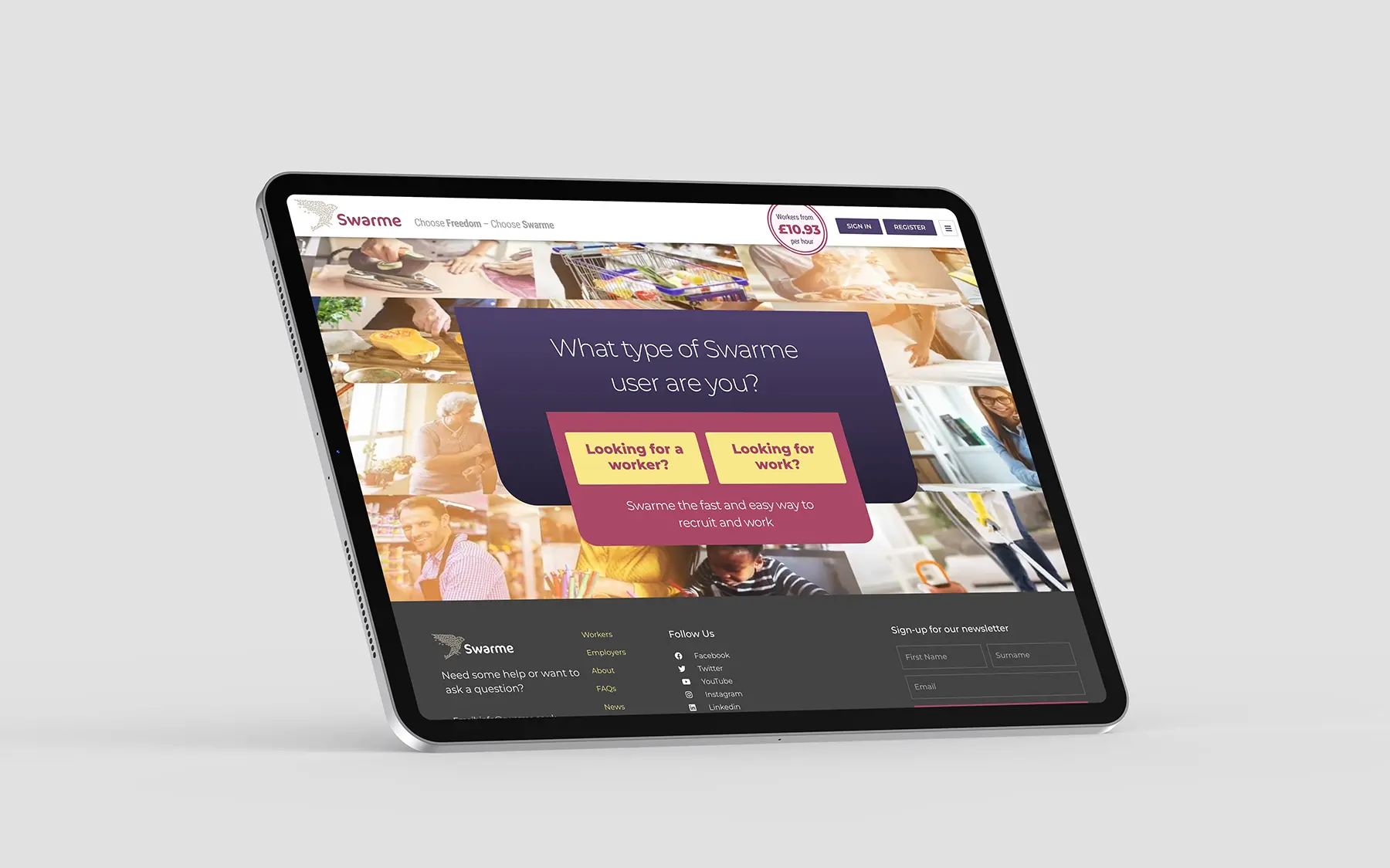
One of the first steps in the design process was to fully understand Swarme’s business model and target audience. We worked closely with their team to gain a deep understanding of their marketplace approach and how it differs from traditional recruitment methods. This helped us to identify key features and functionalities that would be essential for their website, such as a direct entry point for both workers and employers, a job board and worker profiles.

Another important aspect of the project was ensuring that the website was fully responsive and optimised for all devices. With Swarme’s target audience consisting of both workers and employers who may be on-the-go, it was crucial that the website was easily accessible and functional on mobile devices. Our team worked diligently to ensure that the website not only looked great on all devices but also provided a seamless user experience.

The integration with their website with their cross-platform app would allow for a seamless experience funnelling users to the main platform. We worked closely with the Swarme team to ensure that the design and branding of the website were consistent with their app, creating a cohesive and recognisable brand identity.

Throughout the design and development process, we collaborated closely with the Swarme team, providing regular updates and incorporating their feedback to ensure that the end result met their expectations. We also conducted thorough testing to ensure that the website was functioning smoothly and efficiently.

In the end, we were proud to deliver a modern and user-friendly website that effectively showcased Swarme’s unique marketplace approach to recruitment. The website not only complemented their cross-platform app but also helped to promote it, attracting more users and increasing their visibility in the market. It was a pleasure to work with such a forward-thinking and innovative company and we look forward to seeing the impact that Swarme will continue to make in the world of recruitment. 

CLIENT:

Swarme

DISCIPLINES:

WEBSITE DESIGN AND BUILD

SHARE
Swarme home page on an iPad

Move cursor over the image

Swarme home page on an iPad
Touch the image

Swarme recruitment website Read More »

ICC T20 World Cup 2020 thumbnail

ICC T20 World Cup 2020 ticket website

ICC T20 World Cup 2020 ticket website

We were pleased to receive the project of designing a ticketing website for the upcoming ICC T20 World Cup 2020 in Australia. The task at hand was no small feat, as the website needed to not only represent the prestigious International Cricket Council (ICC) but also incorporate the branding of T20, a fast-paced and exciting form of the game. Our goal was to create a visually appealing and user-friendly website that would serve as the go-to platform for fans to purchase tickets for the highly anticipated tournament. 

We began by conducting thorough research on both the ICC and T20 branding guidelines to ensure that our design would accurately reflect their identities. We also took into consideration the target audience, which would primarily consist of cricket enthusiasts from all over the world. This meant that the website needed to be accessible and easy to navigate for both local and international users.

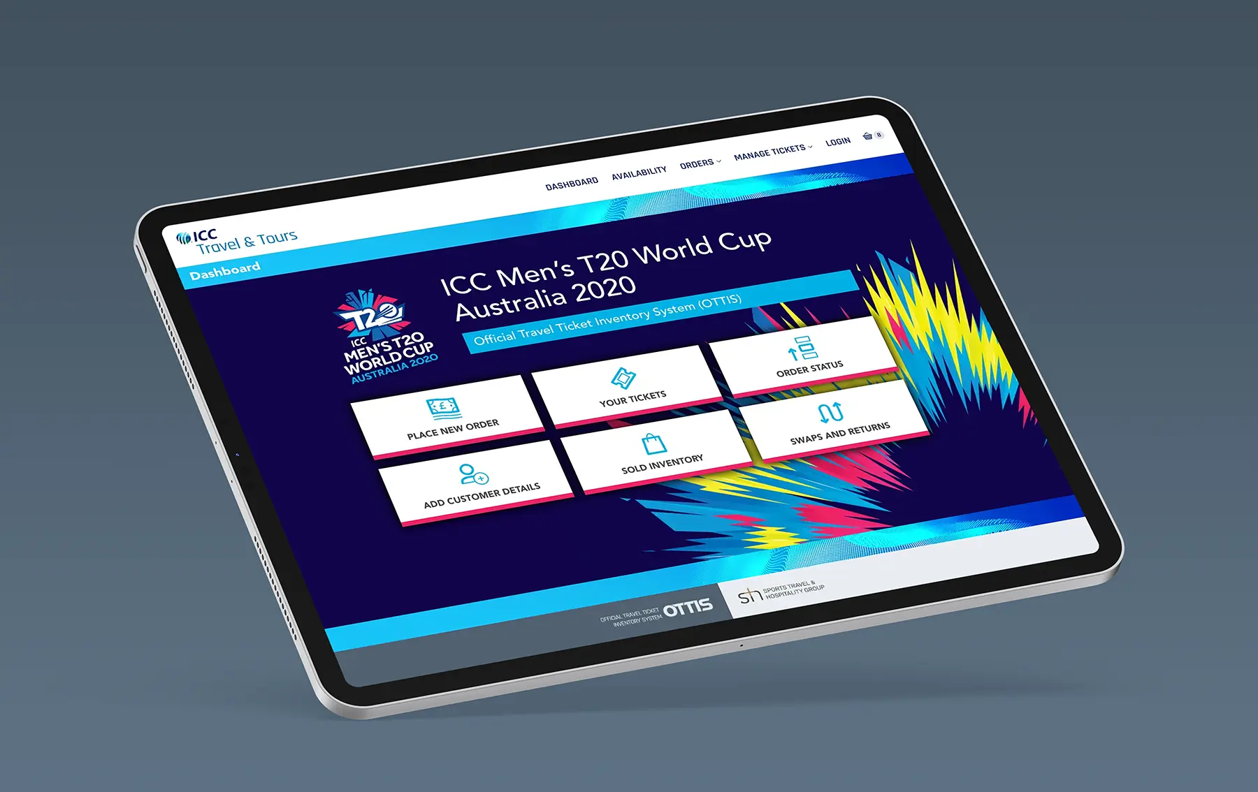
The key pages of the website included the dashboard, ticket ordering, swaps and returns pages. For the dashboard, we wanted to create a dynamic and vibrant design that would immediately capture the attention of visitors. We incorporated elements from both the ICC and T20 branding to establish a cohesive look. The ticket ordering page was designed to be functional and informative, with a clean layout that displayed all the important match information and package options available.

We opted to develop the design using WordPress as this allowed us to quickly build responsive pages and templates that could easily be relocated to the bespoke CMS and eCommerce system that would manage the operation.

The end result was a visually stunning and functional website that served as the primary platform for fans to purchase tickets for the ICC T20 World Cup 2020 in Australia. 

CLIENT:

STH

DISCIPLINES:

WEBSITE DESIGN

SHARE
ICC T20 World Cup ticket website dashboard iPad

Move cursor over the image

ICC T20 World Cup ticket website dashboard iPad
Touch the image

ICC T20 World Cup 2020 ticket website Read More »

Team GB Live Tokyo 2020 website

Team GB Live Tokyo 2020 ticketing website

Team GB Live Tokyo 2020 ticketing website

We were thrilled and honoured to have been given the opportunity to design the Team GB Live Tokyo 2020 Olympics ticketing website. As a team of experienced web designers and developers, we were excited to take on the challenge of creating a website that would not only showcase the Olympics but also provide a seamless and user-friendly ticket purchasing experience for fans. 

Our first step was to thoroughly understand the brand guidelines of Team GB. This was crucial in ensuring that the website accurately reflected the values and identity of the team. We carefully studied the colors, fonts, and overall aesthetic of the brand to incorporate them into our design. We wanted the website to not only be functional but also visually appealing and representative of the Olympic spirit.

Using WordPress as our primary platform, we began creating key pages and templates that would be essential for the website. These included the homepage, event pages, ticket purchasing pages, and information pages. Each page was designed with a mobile-first approach, ensuring that the website would be fully responsive and accessible on all devices. Various features were integrated such as a countdown timer to build anticipation for the games and a map to help users navigate the different venues.

After completing the designs, they were seamlessly integrated into a bespoke CMS and eCommerce system. This allowed the introduction of specific functionality, easy management of content and ticket sales, making the process efficient for both the team and the users. Various security measures were incorporated to ensure a safe and secure online ticket purchasing experience.

However, just as we were nearing the launch of the website, the unfortunate news of the Olympic Games being delayed by a year due to the pandemic was announced. This meant that the website would not be used as the games ended up being held behind closed doors. While we were very disappointed, prioritising public health and safety was paramount.

Nevertheless, we were proud of the website we had designed and the opportunity to be a part of such a prestigious event. 

CLIENT:

STH

DISCIPLINES:

WEBSITE DESIGN

SHARE
Gold Medal Banner

Move cursor over the image

Jade Jones Banner

Move cursor over the image

Account banner

Move cursor over the image

Gold Medal Banner
Touch the image
Jade Jones Banner
Touch the image
Account banner

Team GB Live Tokyo 2020 ticketing website Read More »

Scroll to Top