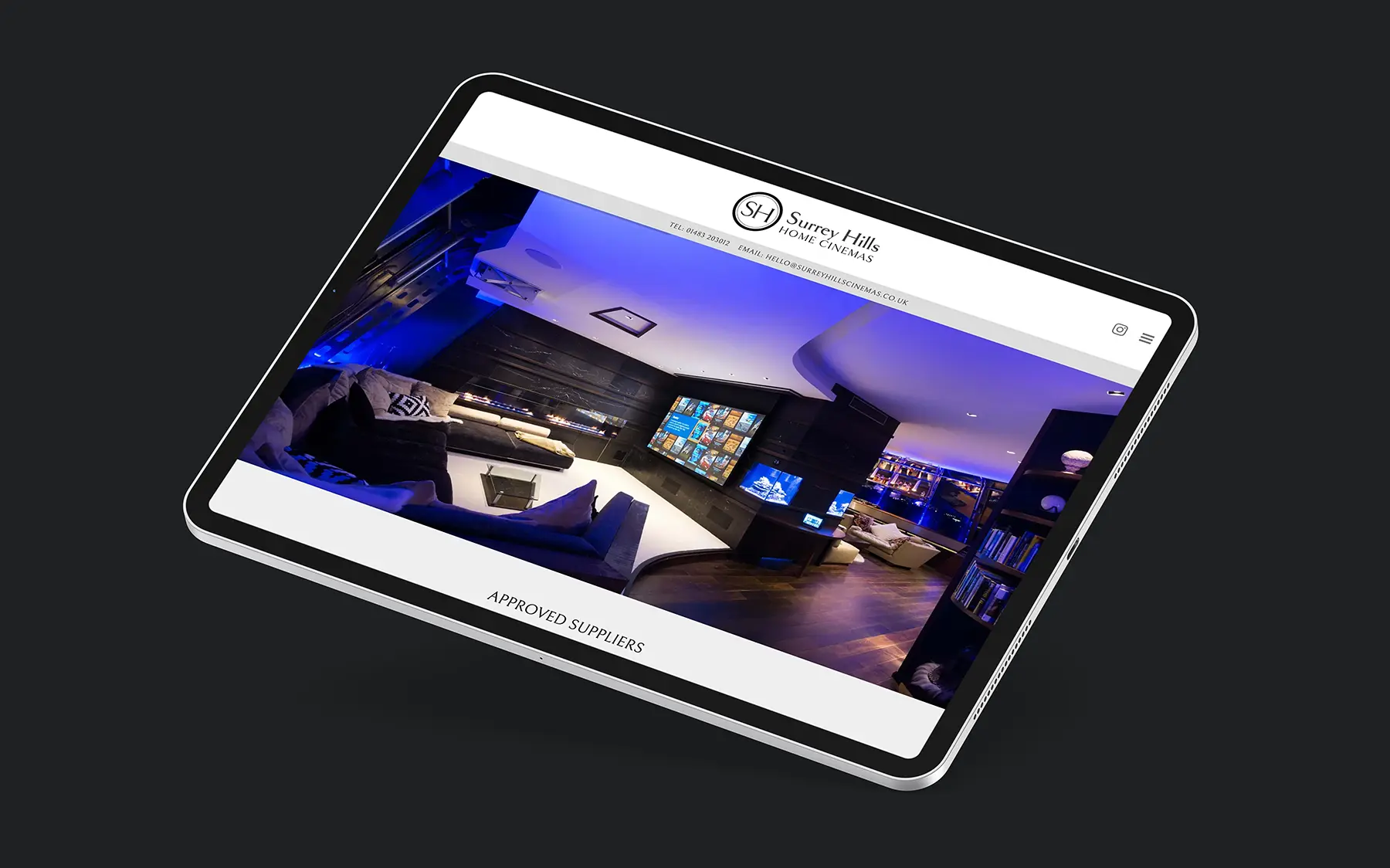
Surrey Hills Home Cinema is a company that has been in the business of creating bespoke cinema rooms for over 15 years. With their expertise and dedication to providing the ultimate cinema experience, they have built a strong reputation in the industry. However, they realised that in order to reach a wider audience and showcase their unique services, they needed a strong online presence. That’s when they approached us to design and build a new WordPress website for them.
From the initial consultation, it was clear that Surrey Hills Home Cinema had a clear vision of what they wanted their website to achieve. They wanted a platform that would not only showcase their various projects but also educate potential clients on the process of building a home cinema. They also wanted the website to reflect their brand image of luxury, elegance, and attention to detail.
To achieve this, our team worked closely with the Surrey Hills Home Cinema team to understand their brand and their target audience. We conducted extensive research on the home cinema industry and analysed the websites of their competitors to identify areas where we could improve and stand out.
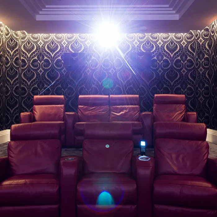
The design process began with creating a modern and visually appealing layout that would capture the attention of visitors. We incorporated high-quality images of their previous projects and used a monochrome palette to let the imagery provide the impact. The website also featured a user-friendly interface with easy navigation, making it easy for potential clients to browse through different sections and gather information.
However, the focus of the website was not only on aesthetics but also on functionality. An informative breakdown of their services, from the type of furniture, fabrics, lighting, and carpets to the screens, projectors, speakers and controllers they use to create the ultimate cinema experience was outlined. We also included a portfolio section to showcase their previous projects that provides a gallery and detailed specification of the installation.
Working with Surrey Hills Home Cinema was a collaborative and exciting experience for our team. We were able to bring their vision to life and create a website that not only showcases their services but also educates and engages potential clients. The new website has received positive feedback from both their team and clients, and we are proud to have played a part in their continued success in the home cinema industry.
When Axis Commercial Finance approached us to help develop their brand and create their website, we were excited to take on the challenge. As a financial company, they wanted to establish a strong online presence, but they were lacking in content and were unsure of how to effectively present their services and values to potential clients. We understood the importance of a strong brand and website in the competitive financial industry and we were determined to help them stand out.
Our first step was to conduct thorough research on the company, their target audience and their competitors. This helped us gain a deep understanding of their brand and what sets them apart from others in the market. We then worked closely with the team at Axis Commercial Finance to define their brand identity, including their mission, vision, and values. This helped us create a cohesive and consistent brand image that would resonate with their target audience.
Next, we focused on creating the website. However, due to the limited content available, we decided to take the approach of building a single-page site. This meant that all the necessary information would be presented on one page, with the menu items scrolling to different sections within the page. This not only allowed us to effectively showcase their services, but it also made for a more user-friendly experience for visitors.
After a few rounds of revisions and fine-tuning, the website was complete. The final result was a sleek, modern, and user-friendly site that effectively showcased their brand and services. We are confident that this website will serve as a valuable tool for Axis Commercial Finance to connect with their audience and grow their business.
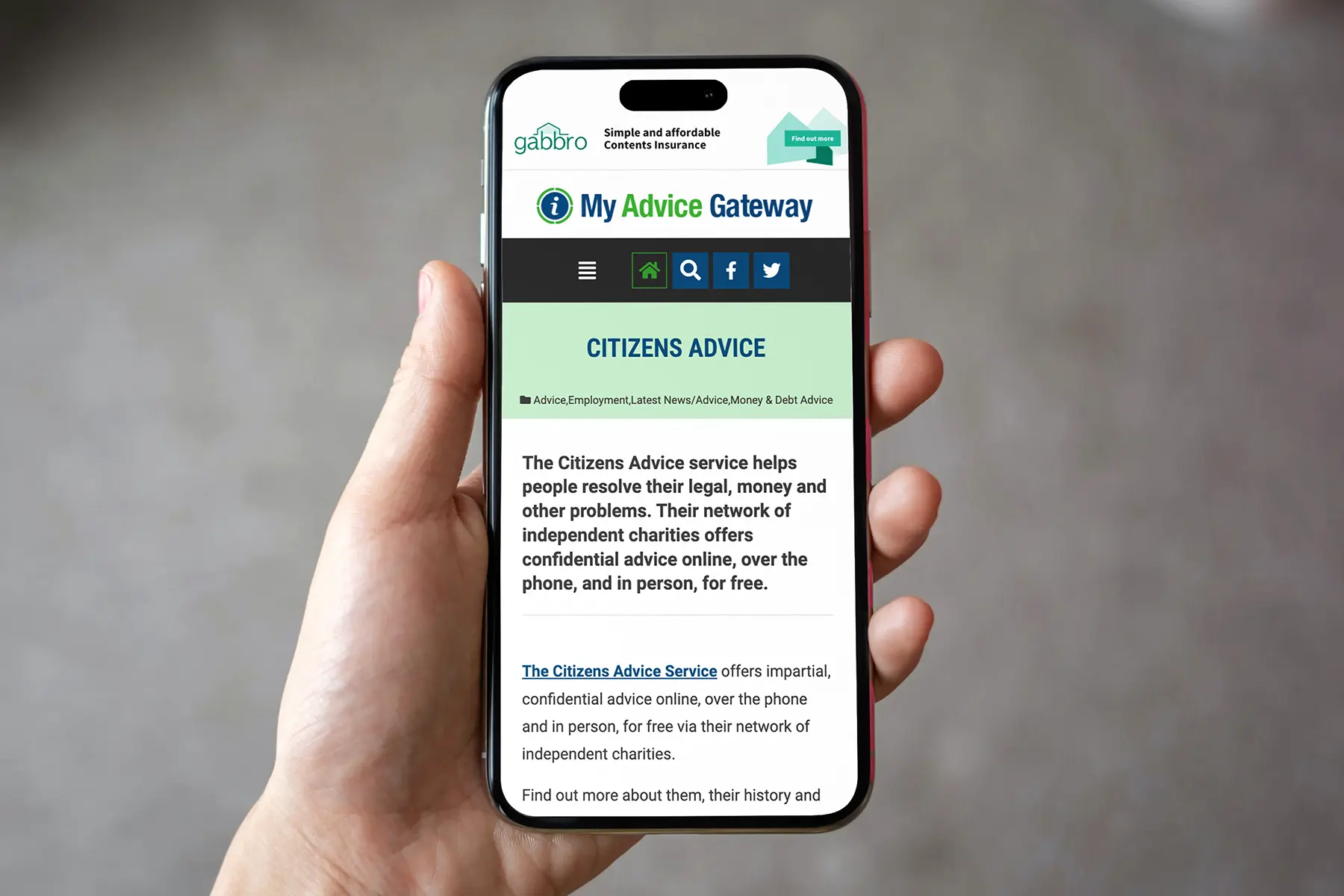
My Advice Gateway is a vital platform for individuals who are seeking guidance and support in claiming benefits, finding job opportunities, and accessing helpful resources. However, the previous website for this organisation was outdated and not user-friendly, which made it difficult for users to navigate and access the information they needed. We were approached by My Advice Gateway to create a new website that would better serve their users and fulfil their mission of providing easy access to important resources.
The first step in this project was to understand their needs and goals. We conducted thorough research on the organisation, its target audience, and the services it offers. This helped us gain a better understanding of their vision and what they wanted to achieve with their new website. We also analysed their previous website and identified the areas that needed improvement.
After gathering all the necessary information, we proposed a solution that would best suit their requirements. We suggested rebuilding the website using the WordPress platform. WordPress is a popular and user-friendly content management system that would make it easier for them to manage their website and update content regularly.
Our team worked closely with My Advice Gateway to design a website that was visually appealing, easy to navigate and aligned with their brand image. We incorporated a clean and modern design with intuitive navigation to ensure that users could easily find the information they needed. We also made sure the website was accessible and responsive, meaning it would function seamlessly on all devices, including desktops, laptops, tablets, and smartphones.
Throughout the development process, we provided regular updates and implemented their feedback. We also provided training to their team on how to manage the website and update content.
The new website was launched successfully, and the organisation saw an increase in traffic and engagement from users. The user-friendly interface and optimised content made it easier for individuals to find the help and support they needed and was able to fulfil its mission of providing a free resource for those in need.
In conclusion, our partnership with My Advice Gateway was a successful one, and we are proud to have helped them create a new website that better serves their users. We are confident that with this new platform, My Advice Gateway will continue to make a positive impact on individuals seeking guidance and support in claiming benefits, finding job opportunities and accessing helpful resources.
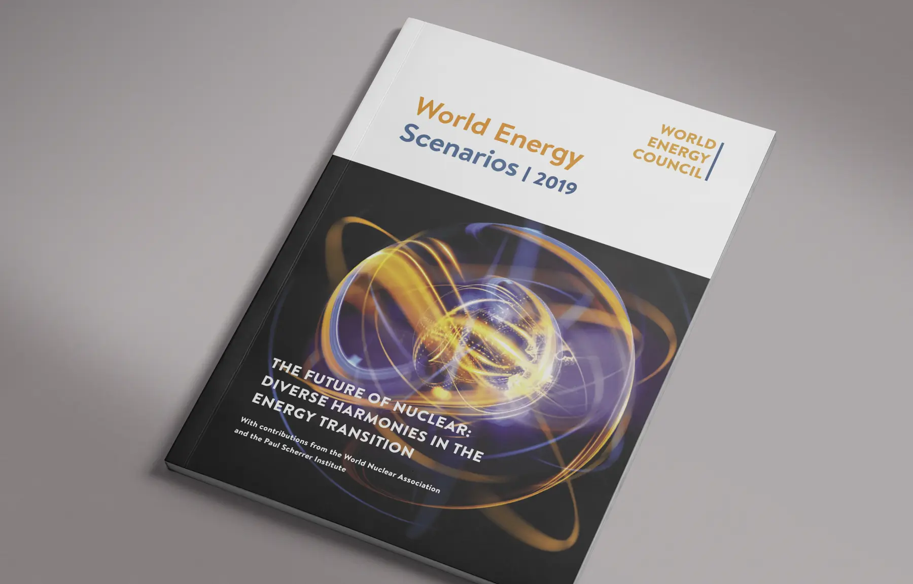
When the World Energy Council approached us to design their Nuclear Scenarios report, we were very pleased for the opportunity. Up to now we had only been supplying printing services, but for this project, we were tasked with creating the entire report and summary document. This was an exciting challenge for us, as it allowed us to showcase our skills and work closely with the WEC to bring their vision to life.
The first step in the design process was familiarising ourselves with the World Energy Council’s brand guidelines. As a reputable and well-established organisation, it was crucial for us to adhere to their branding in order to maintain consistency and credibility.
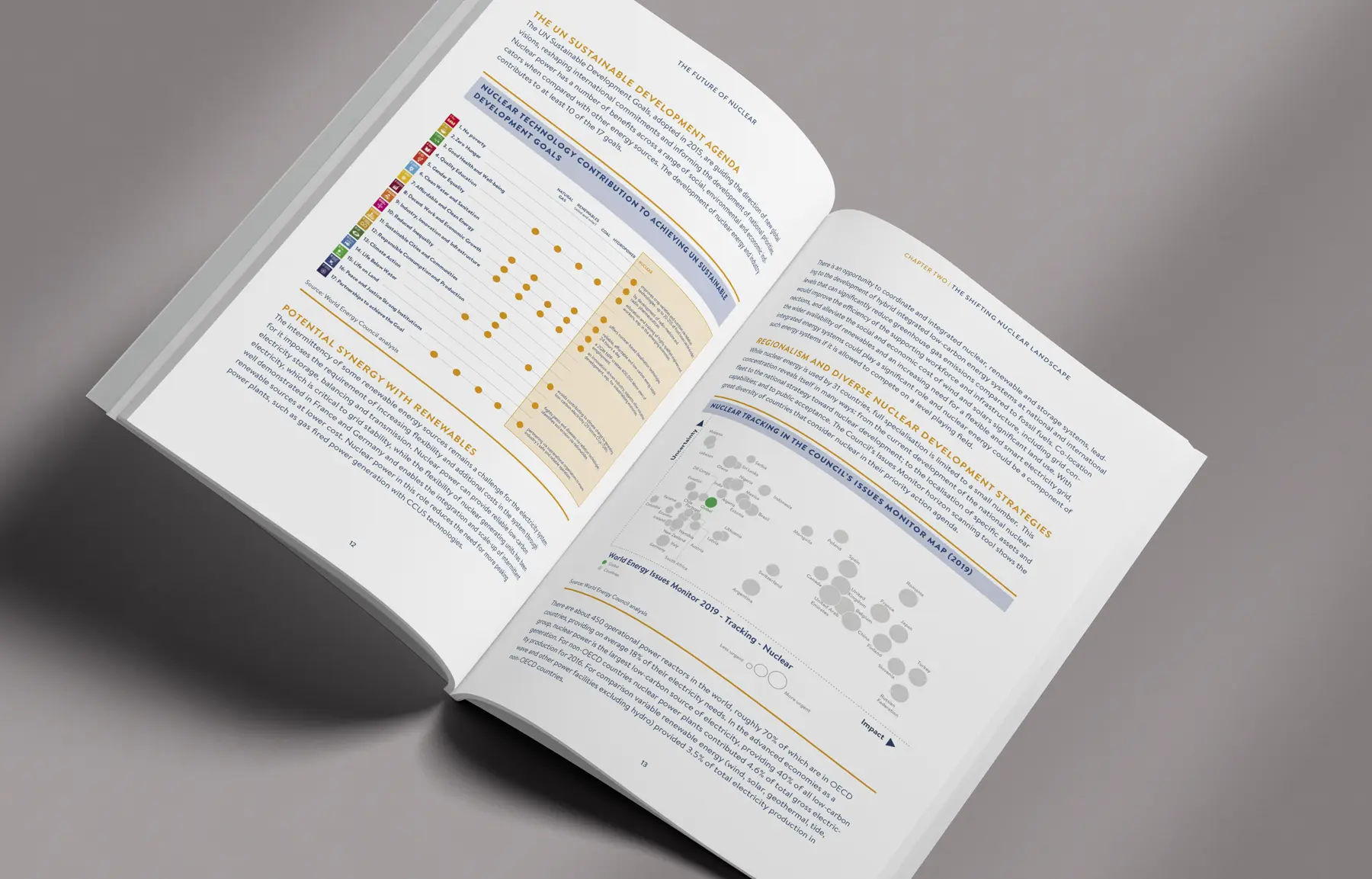
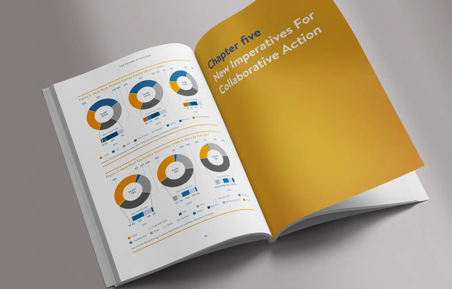
The report was a comprehensive 66 pages, filled with data, charts and graphs. Our team of designers worked closely with the WEC to organise the information in a visually appealing and easy-to-understand format. Infographics and visually striking charts to make the information more engaging and digestible for the readers.
The summary document, on the other hand, was a condensed version of the report, consisting of only 4 pages. Our challenge was to convey the key points and findings of the report in a concise and impactful manner.
Throughout the design process, we collaborated closely with the World Energy Council to ensure that the final product met their expectations and accurately represented their research and findings.
In the end, we were immensely proud of the final result. The Nuclear Scenarios report and summary document were not only visually appealing but also effectively communicated the WEC’s insights and recommendations. It was an honour to be a part of this project and we look forward to future collaborations.
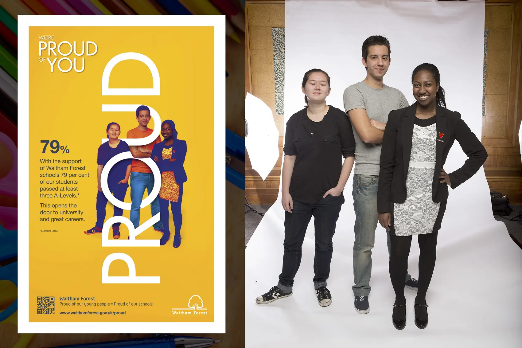
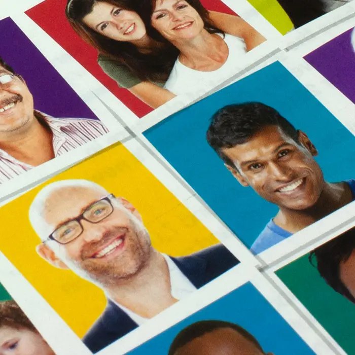
The standard of education in the borough of Waltham Forest had once again improved and we were asked to create an awareness campaign to highlight the council’s commitment to support and invest in schools to continually improve them.
A group of students with particular success stories were chosen to lead the campaign. They were photographed and placed within the word ‘proud’ to portray the council’s support playing an integral part of the increased success.
A second phase of the campaign was developed from teachers perspectives telling their success stories from the classroom.
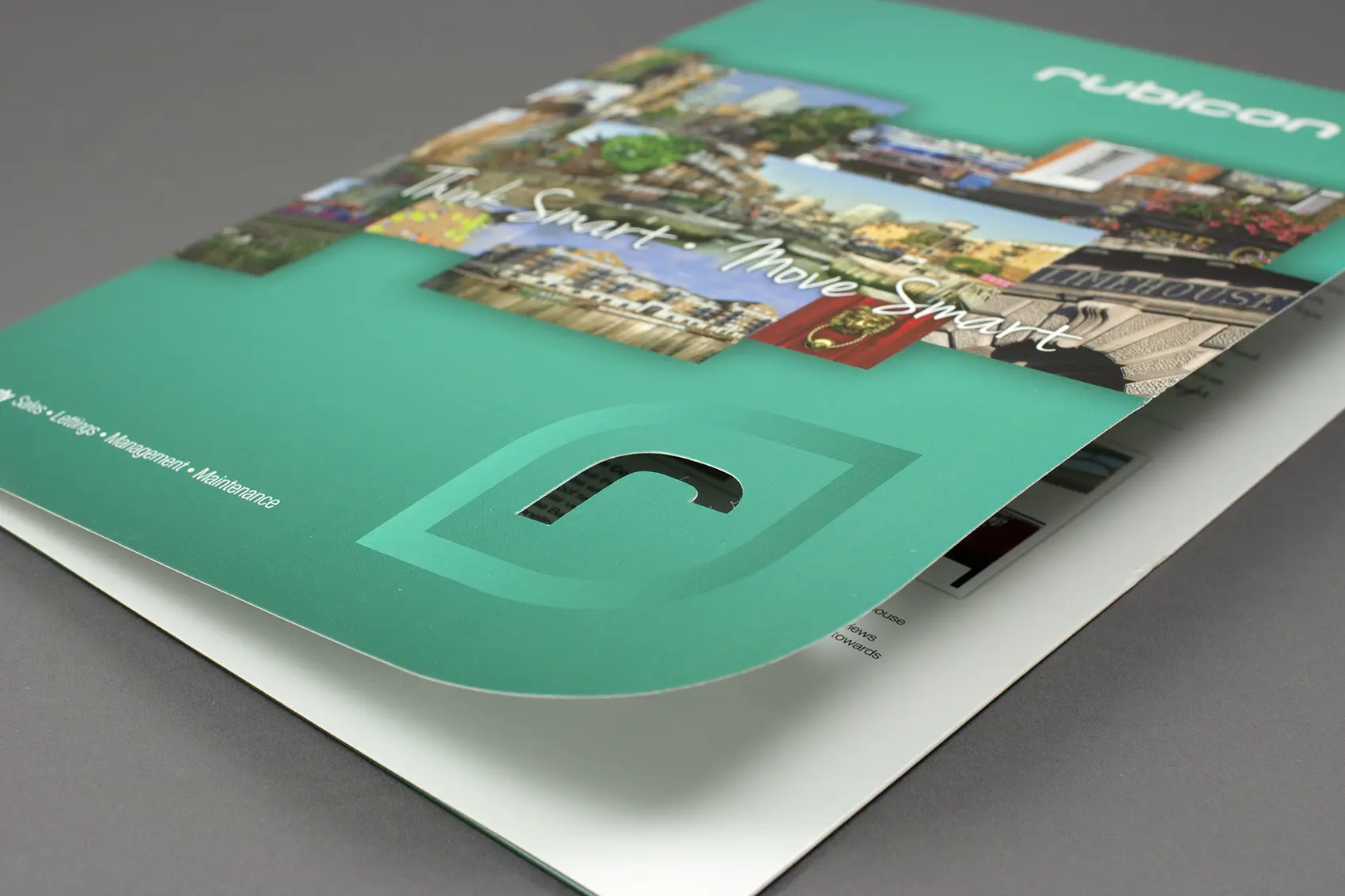
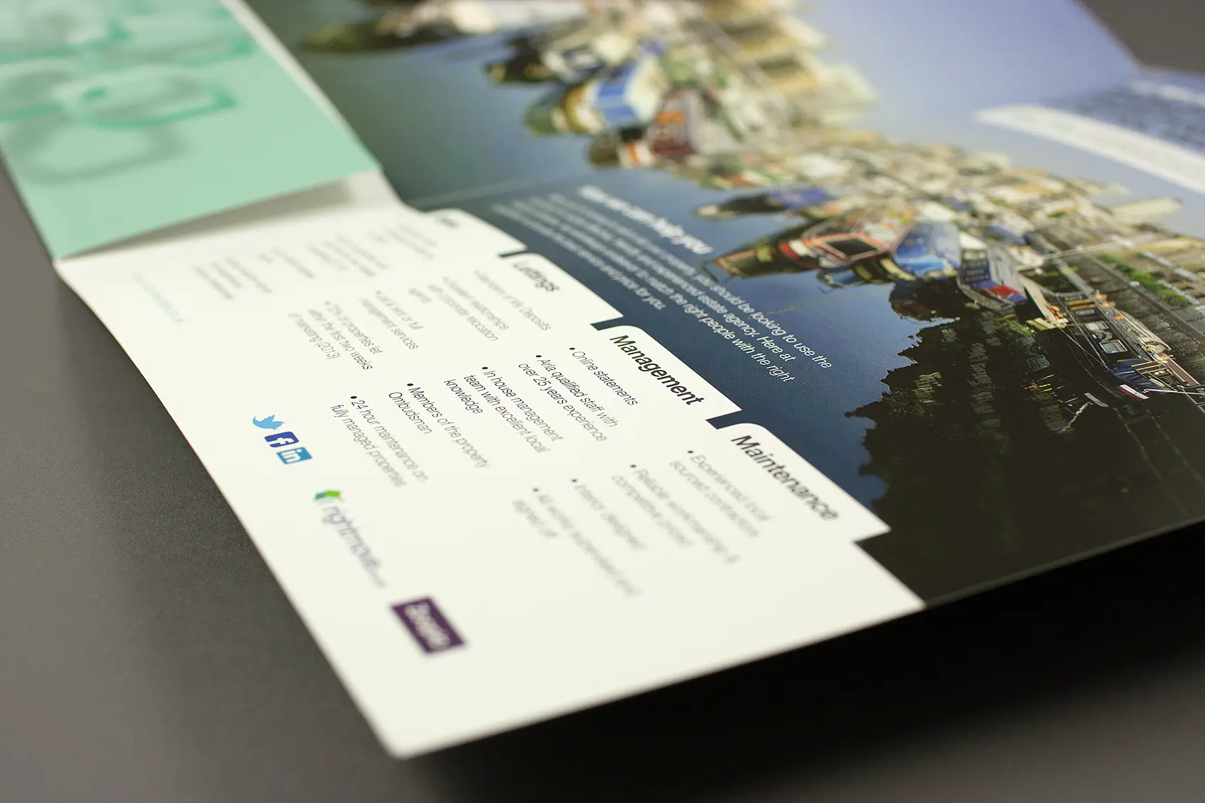
When designing a folder for Rubicon Estates the key requirements were to show they are based in Limehouse, it had to be a little unusual and have something of a wow factor.
We briefed a photographer to take lots of images of local interest which we ran across the front and back cover so anyone who knew Limehouse would instantly be familiar. The corner of the cover was die cut to reflect their logo and be a little unusual and the wow factor came from a photograph of Limehouse basin which was taken in three sections, stitched together and printed across the whole inside of the folder to make one stunning panoramic.
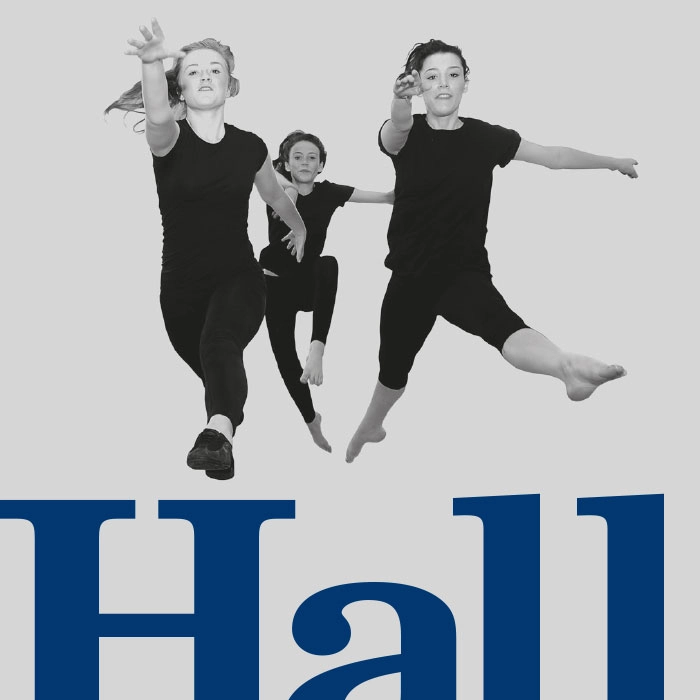
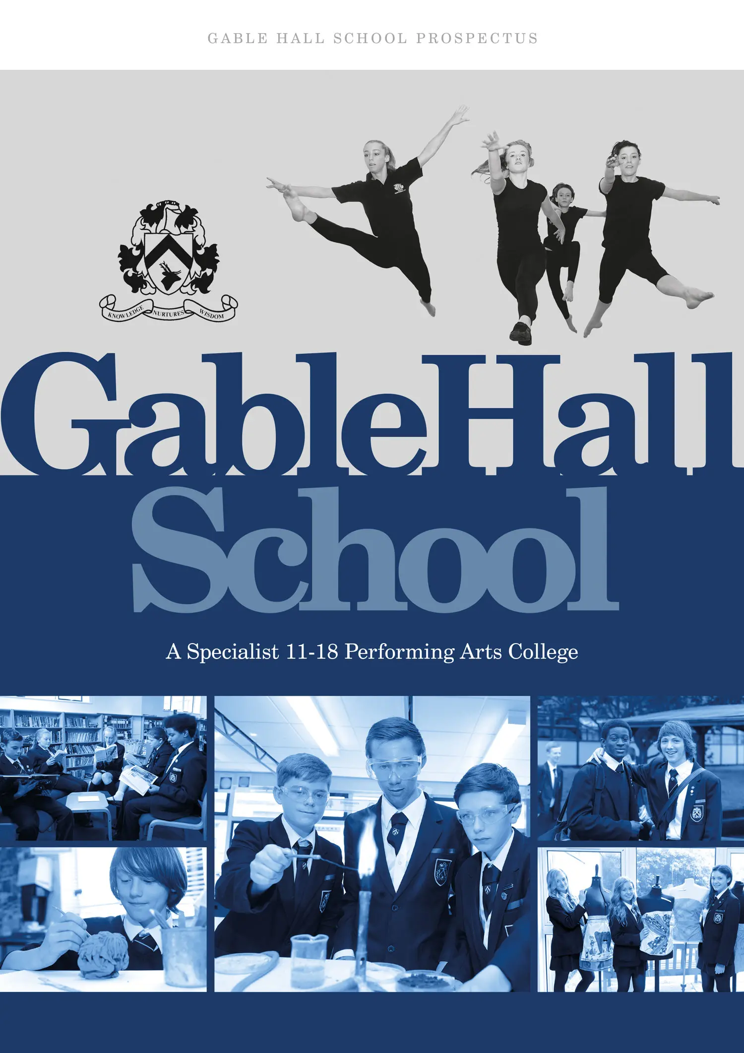
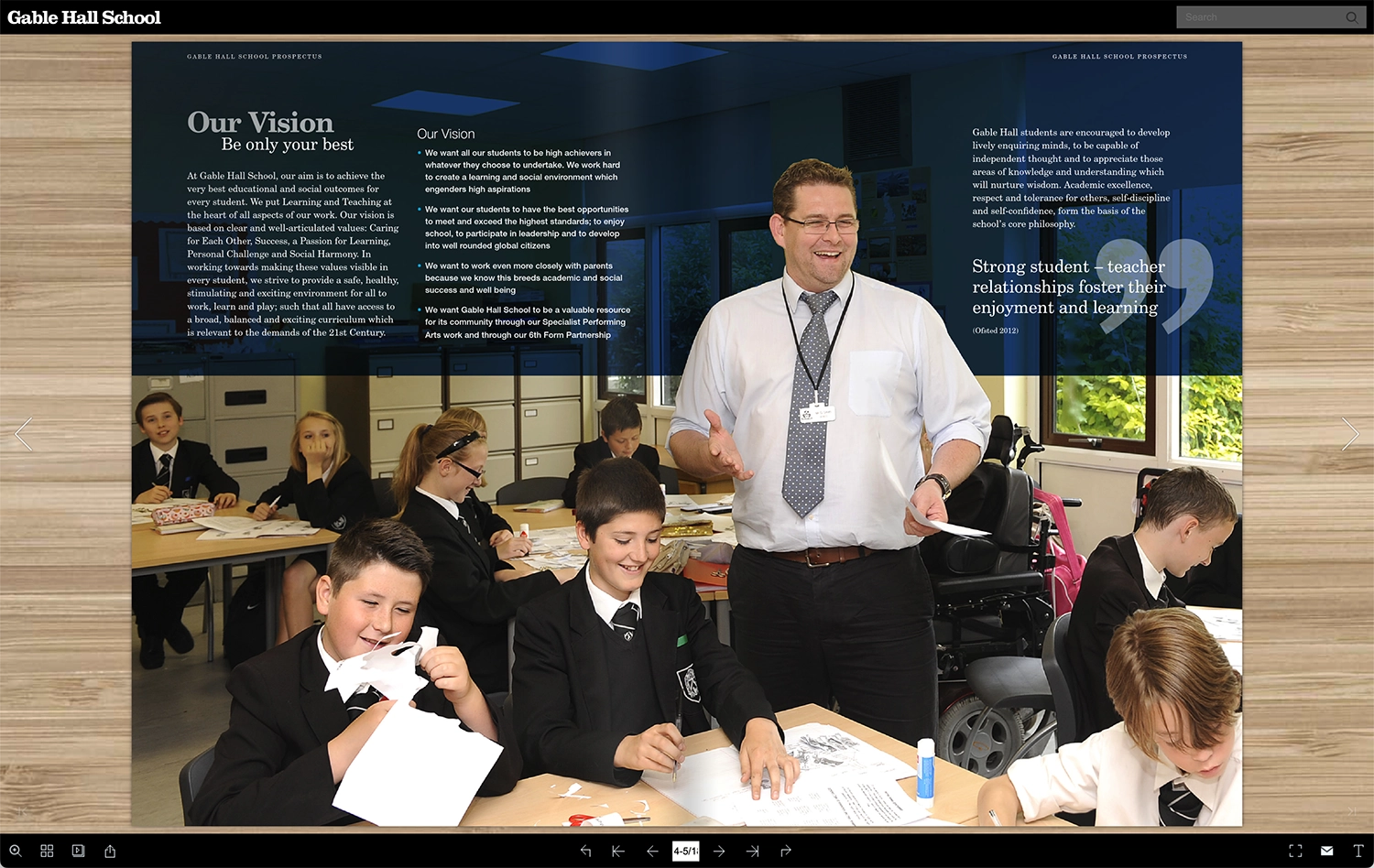
Gable Hall School specialises in the performing arts without detracting from all other academic fields and this was prominent in our mind when we were asked to design their prospectus
They wanted the prospectus to be viewed predominantly online so we created a page turner for them which could be embedded into their current website. The 3D page turning effect creates a real wow factor and with the functionality to print, download, share and enlarge to full screen as some of it’s extra features this is a very effective method to engage and get a message across.
Take a look at the Gable Hall School page turner here
Disaster recovery specialist Thompson & Bryan approached us wanting to redesign their website.
Thompson & Bryan has an amazing trading history dating back to 1867 but felt their website wasn’t aging as well, so they asked us to bring it up to date. Their key requirements were to ensure the site informs when they were established, to make people want to read what can be a dull subject and finally, appear visually different from their competitors.
The new responsive website we created is very image led with the information broken down into sections to make it interesting and easier to absorb. With a unique menu system and the fixed full width background images creating an intriguing reveal effect as you scroll down the page, Thompson & Bryan’s brand is now firmly in the 21st century.
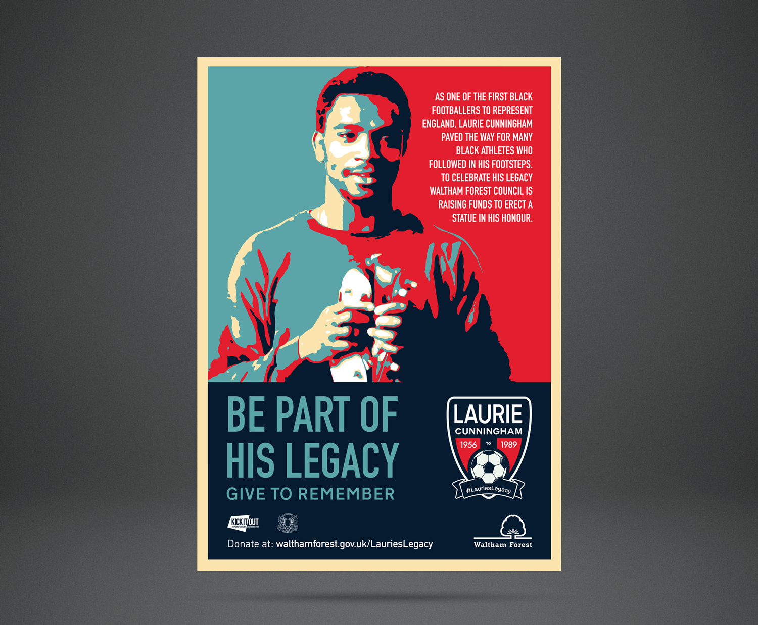
All football fans will remember the name Laurie Cunningham, the first black player to represent England at any level.
He was to win a total of six caps for England and was first British player to transfer to Real Madrid. He died in 1989 in Spain, tragically early in his illustrious career. Leyton Orient and Waltham Forest council are commemorating Laurie Cunningham’s years at Brisbane Road by launching a fund raising campaign to commission a statue by noted sculptor Graham Ibbeson, famed for his statues of sporting figures such as Don Revie, Fred Truman and Dickie Bird as well as his iconic Eric Morecombe. We were honoured to be asked to design the campaign material and attend the campaign launch at Leyton Orient grounds.
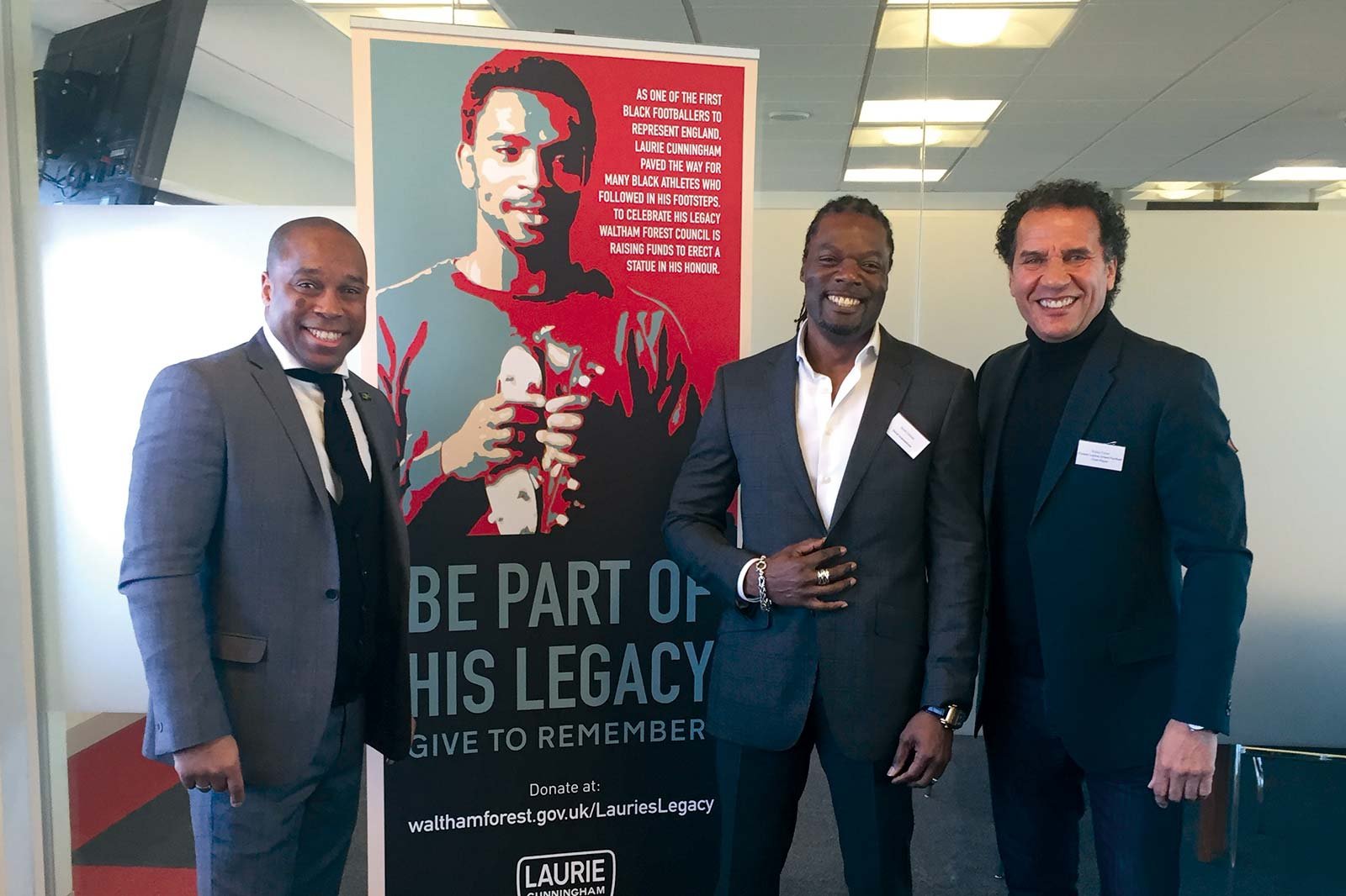
We are pleased to announce the target for fundraising was met and the majestic 2.2m high statue was unveiled outside the Leyton Orient stadium in November 2017.
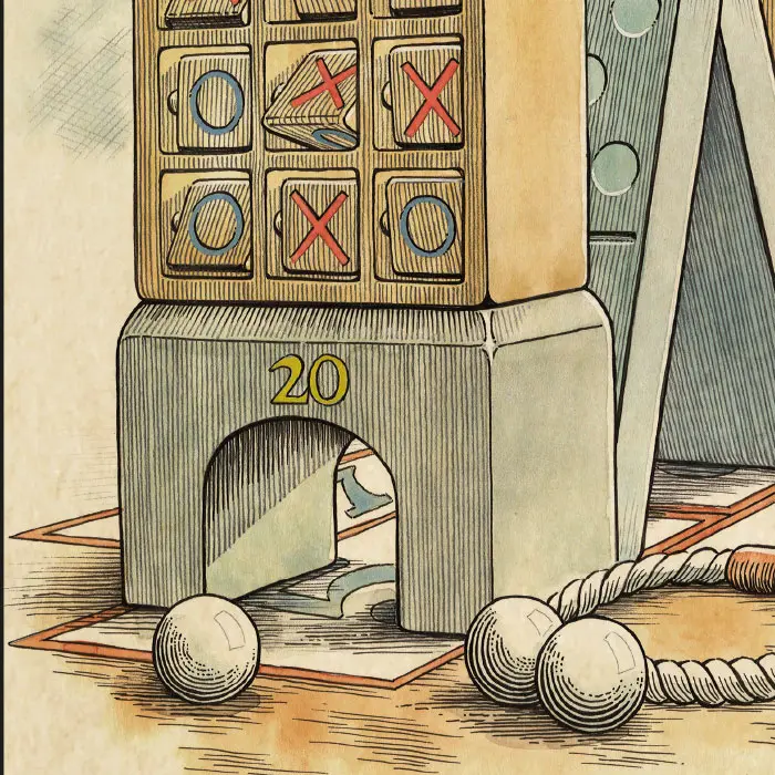
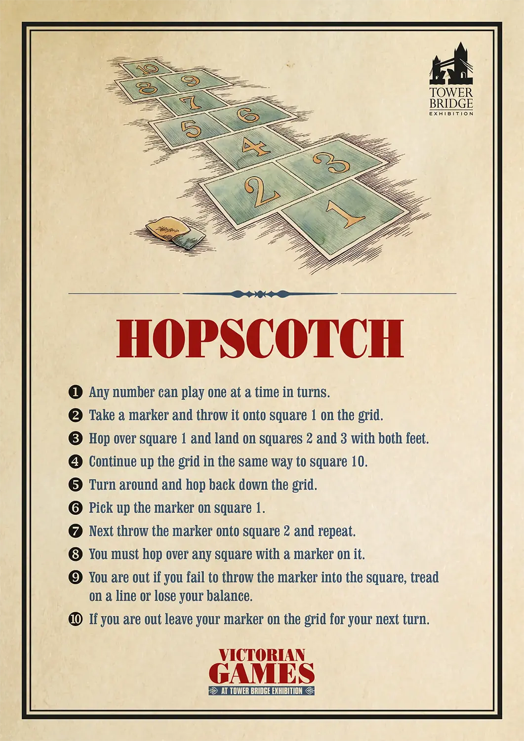
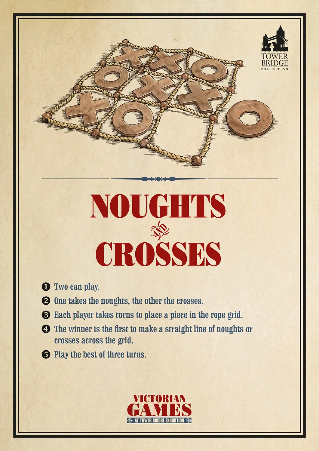
We have received a commission to design a poster advertising the new ‘Victorian Games’ promotion at Tower Bridge.
Visitors are encouraged to participate in authentic victorian games set-up in various locations throughout the bridge.
We also produced an instructions poster for each of the six games. Running every school holiday throughout the year, it proved to be just as popular with the adults as the children. It’s surprising how good many of the old games still are.
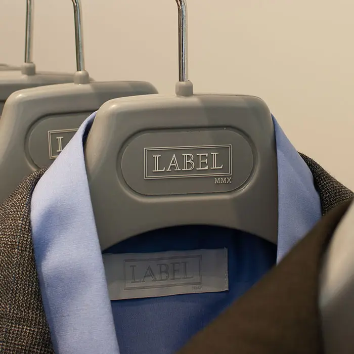
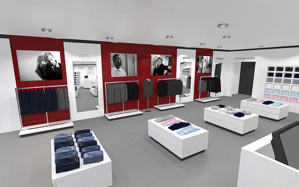
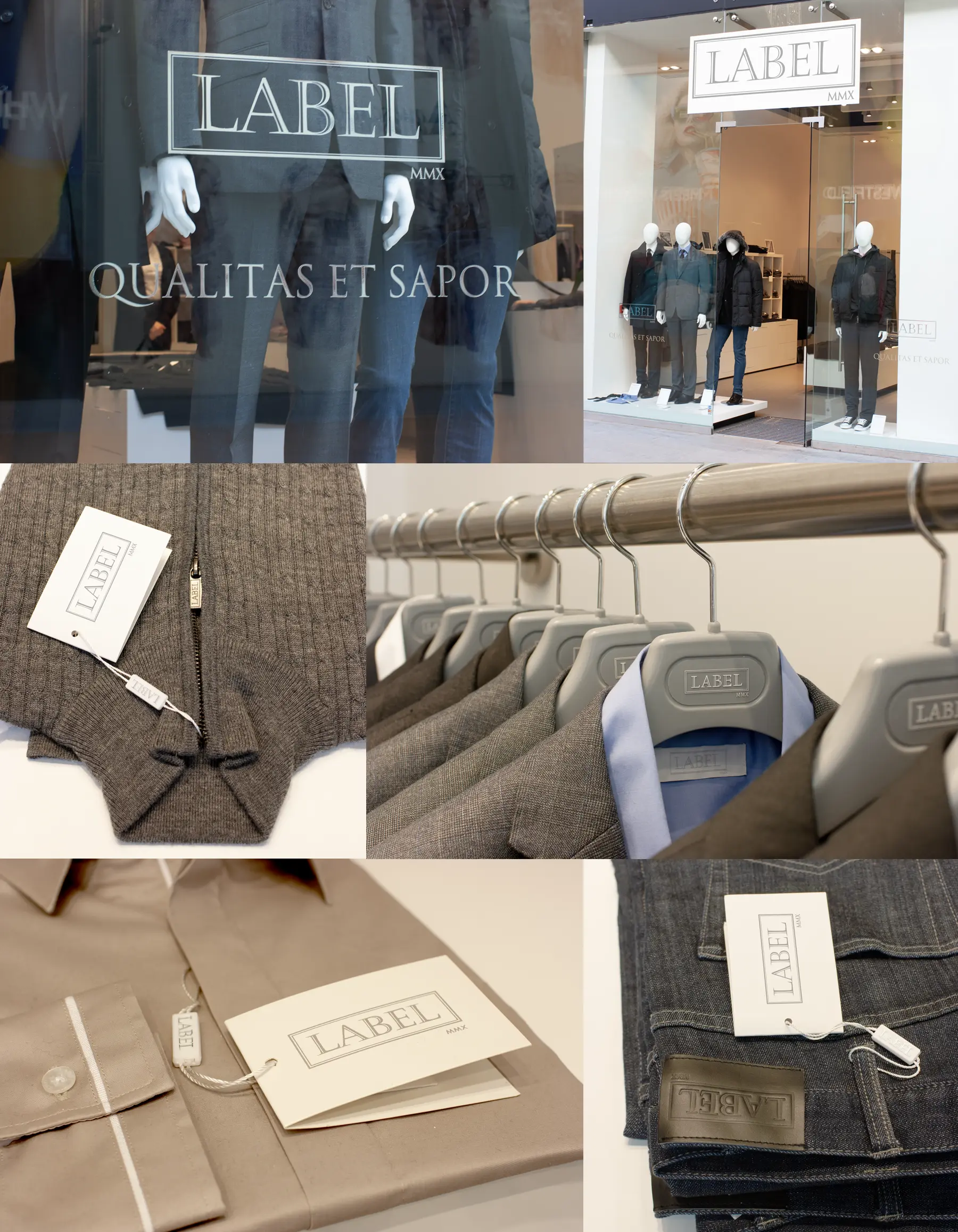
An independent men’s clothing suppliers were launching a new clothes range and asked for our help to build the brand.
For many years the guys at the newly formed men’s clothing company called Label had been sourcing quality apparel from China and supplying high street stores such as Next and Marks and Spencer for their premium range. With an existing supply chain in place and a top fashion designer to create the bespoke range they decided to take the leap and launch their own shop and line of high quality men’s clothing.
We were asked to design the brand with a strong classic presence to be applied to labels, tags, hangers, internal signage and the shop facade. We also created 3D renders to visualise the shop fittings and flow.
Top 100 chartered financial planners Chadney Bulgin approached us looking to build on their brand.
After a recent redesign of their logo and stationery Chadney Bulgin commissioned us to evolve their brand and create a suite of promotional leaflets as well as redesigning their website. They particularly wanted to promote a look and feel that, whilst having the gravitas of an established business, should be more contemporary and approachable. To achieve this the cover of the leaflets adopt a classic structure with an unimposing san serif font for the title, combined with a golden filter applied to the feature images adds just a touch of prestige.
Chadney Bulgin realised from their previous website that they didn’t have the tools to engage with their clients or attract new ones. Now they have a form to capture new sign-ups and to whom, along with existing clients, they now send out regular email newsletters. They have also built-up an impressive resource centre on the site which contains a mixture of news, fact sheets and business advice to keep their clients updated.
Chadney Bulgin was bought by the Fairstone Group in 2021.
CLIENT:
CHADNEY BULGIN
DISCIPLINES:
BRANDING, GRAPHIC DESIGN, WEBSITE DESIGN & BUILD, VIDEO EDITING
We were delighted to be asked to redesign CTV Outside Broadcast website.
CTV are one of the worlds leading outside broadcast companies, they work on renowned events around the globe such as the Olympics, the Ryder Cup and the Brit Awards to name a few. It had been some time since their website was reviewed and was looking tired and outdated.
Keeping to their existing brand, they wanted to the new site to reflect their positioning within the market and present the technical details for their fleet of vehicles in a more digestible format. The new site is engaging with a greater emphasis towards their social media and as it’s now responsive their SEO has improved too.
CTV have now merged with Telegenic to form EMG UK.
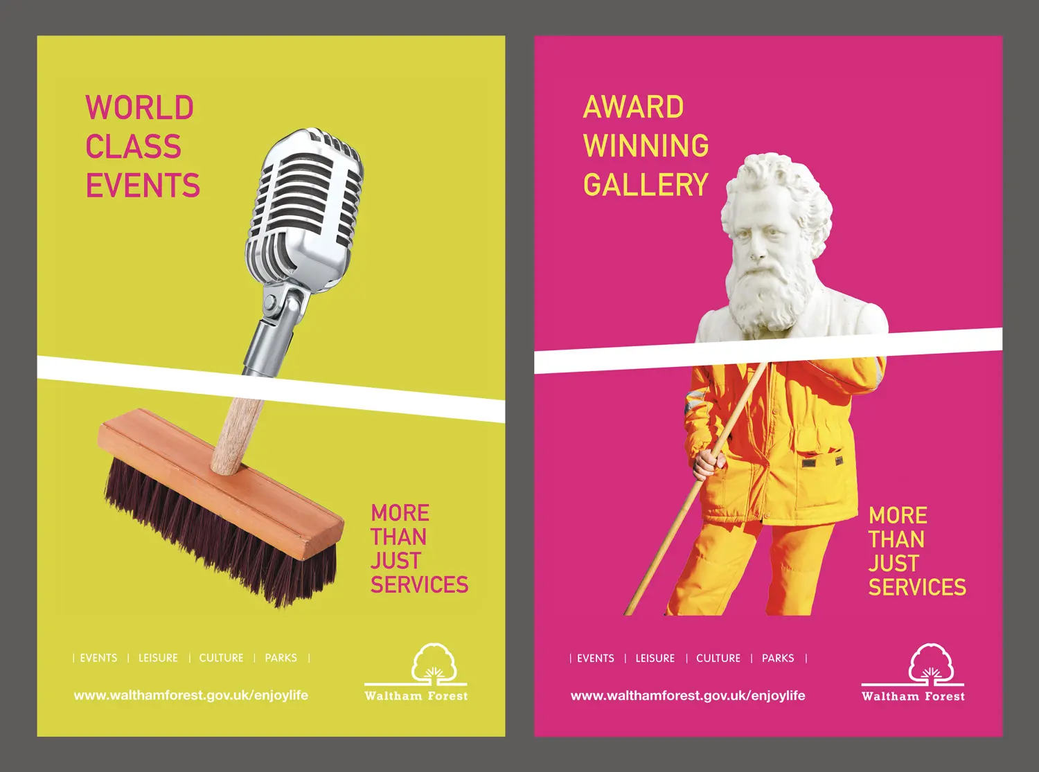
In response to the socio-economic changes and the increased number of events happening in the borough it was felt that residents should be reminded of the wide range of work carried out by Waltham Forest council.
To achieve this we created a campaign which highlights the councils role of maintaining street lighting, bin collections, street cleaning and all the other essential services residents expect, as well as it laying on free concerts, providing award winning galleries and free parks which are often taken for granted.
This campaign consisted of a suite of posters displayed on bus shelters and in the council’s newspaper to promote awareness. It culminated in the design and production of a what’s on guide to events last summer entitled Enjoy Life, more than just services to highlight all the improvements and services the council provides.
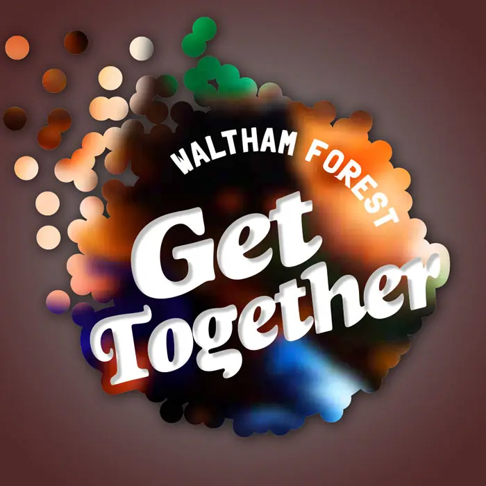
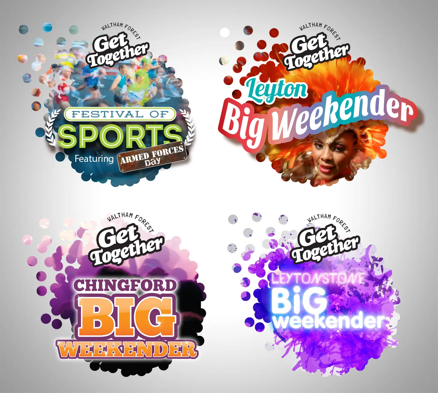
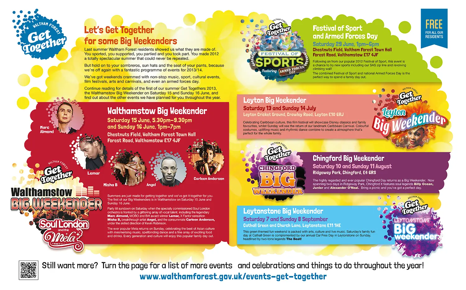
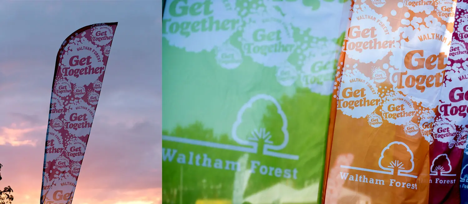
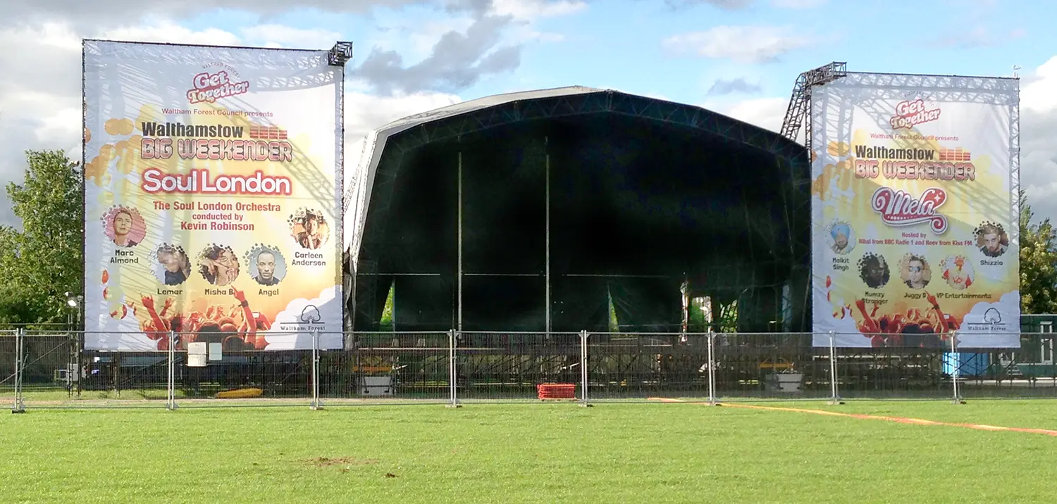
Waltham Forest traditionally holds a series of family entertainment events throughout the year and wanted to align them as a linked program of events under the umbrella title of ‘Get Together’.
We created the over arching ‘Get Together’ brand first which used a series of concentrated dots positioned to express the concept of coming together. Individual identities were then created for each event to work harmoniously with the parent brand. The project was rolled out across printed, online and outdoor media.
We were pleased to win the design and print tender for Coventry council and one of the projects we’ve worked on is the CHOICE Prospectus.
The Adult Education Service in Coventry offers a choice of courses in a wide range of subjects, has venues across the city and produces a 44 page publication with 130,000 printed and distributed to residents.
The council wanted the prospectus to appeal to all age groups, look welcoming and inclusive. We achieved this by designing a pictorial cover that shows the diversity of CHOICE learners.
We also produced it as an interactive course finder that users can look for a course on a particular subject, browse courses at specific venues and browse courses in one of the three Adult Education Service districts online.
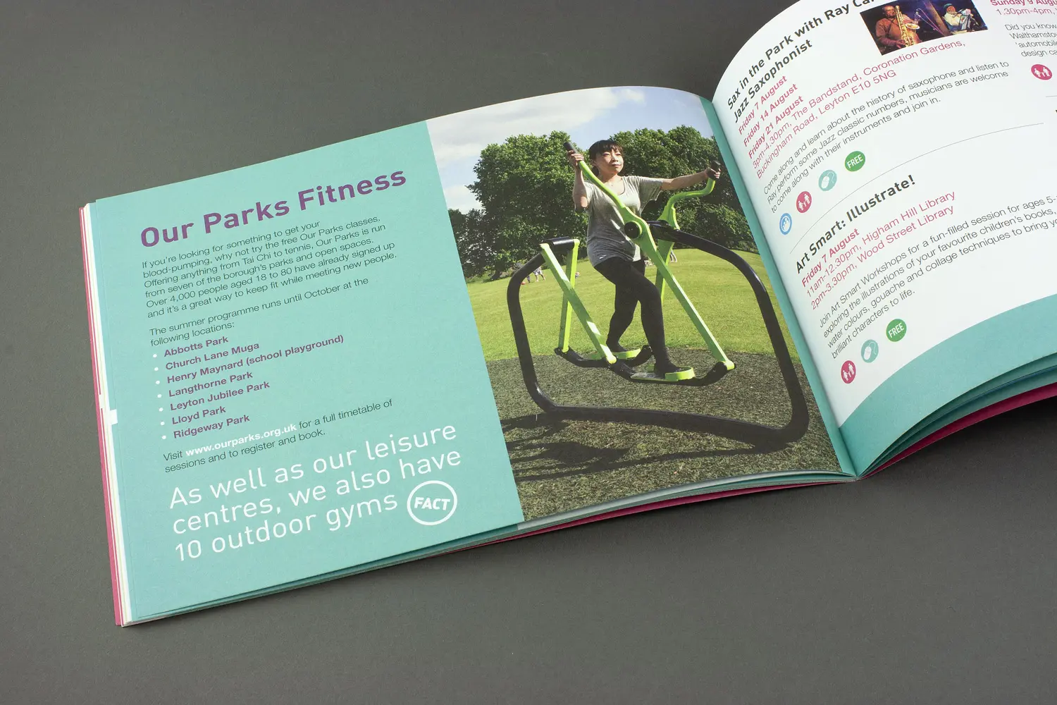
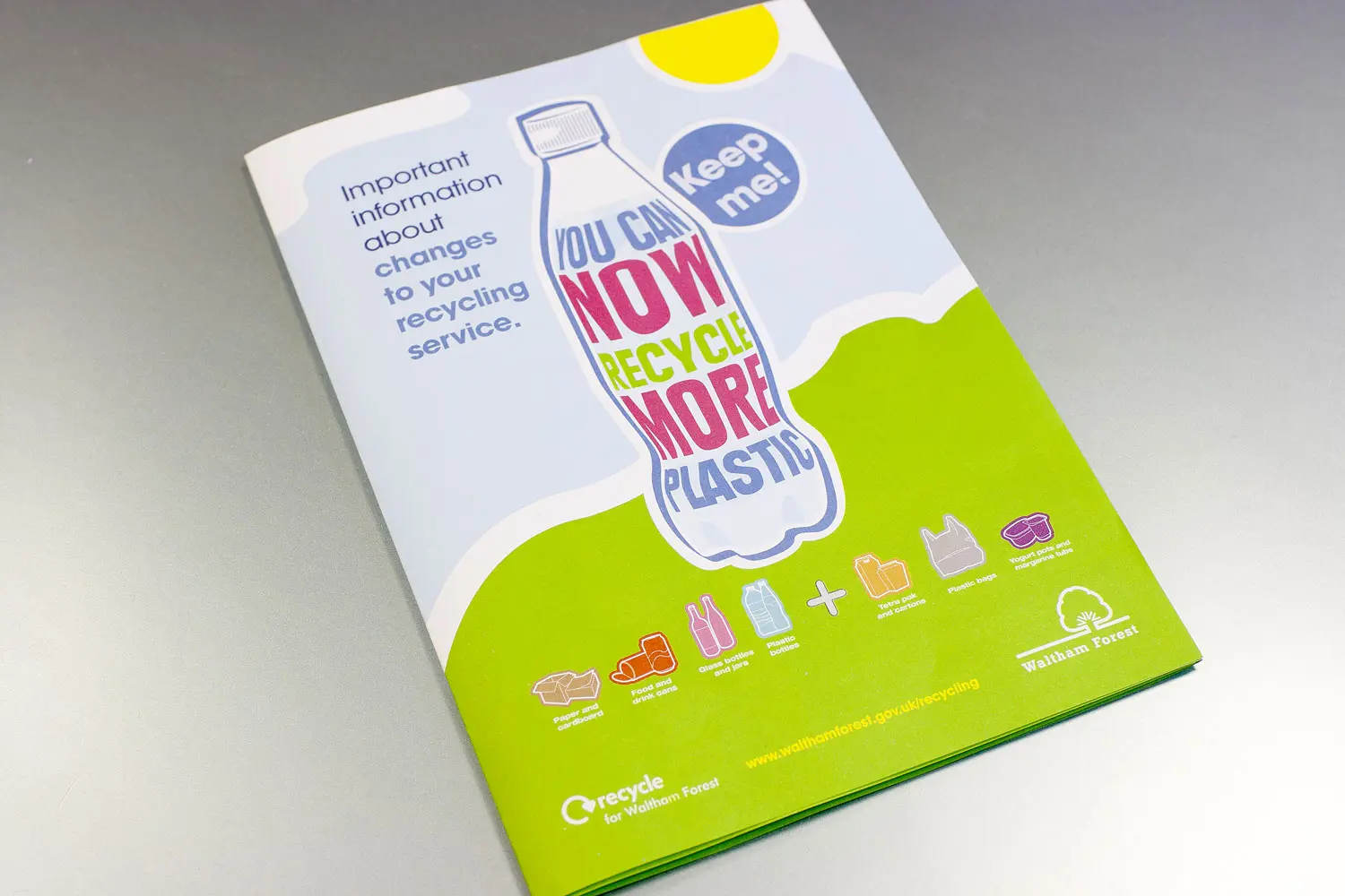
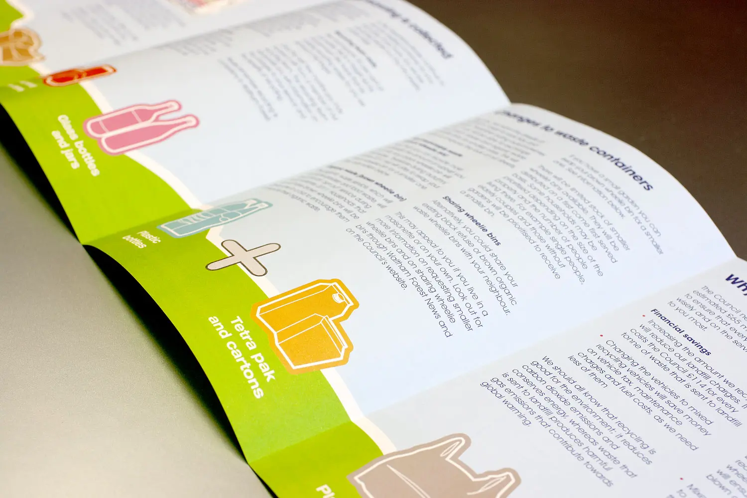
Due to the ongoing success of the previous recycling campaign we created for the London Borough of Waltham Forest the council decided to expand the campaign to include a range of other materials, including a number of plastics previously excluded.
Working with the council communications team we felt that the best way to show the range of items now included was to create a suite of illustrations that could be used over all the elements of the campaign from billboards, press ads, flyers and an information pack that has been distributed to every household in the borough.
The final design was both eye catching and informative across all communication channels, a successful outcome to quite a complicated brief.
CLIENT:
LONDON BOROUGH OF WALTHAM FOREST
DISCIPLINES:
BRANDING, GRAPHIC DESIGN, PRINTING, FULFILMENT, DISTRIBUTION
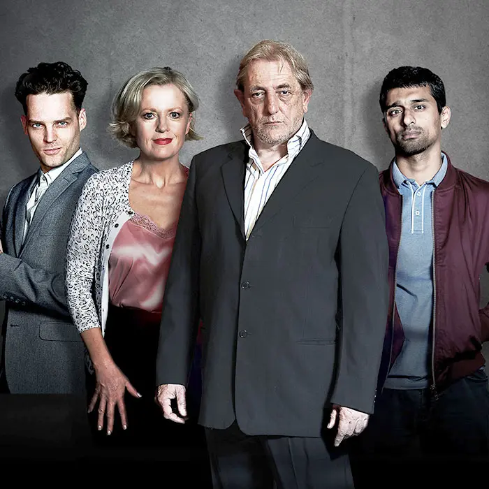
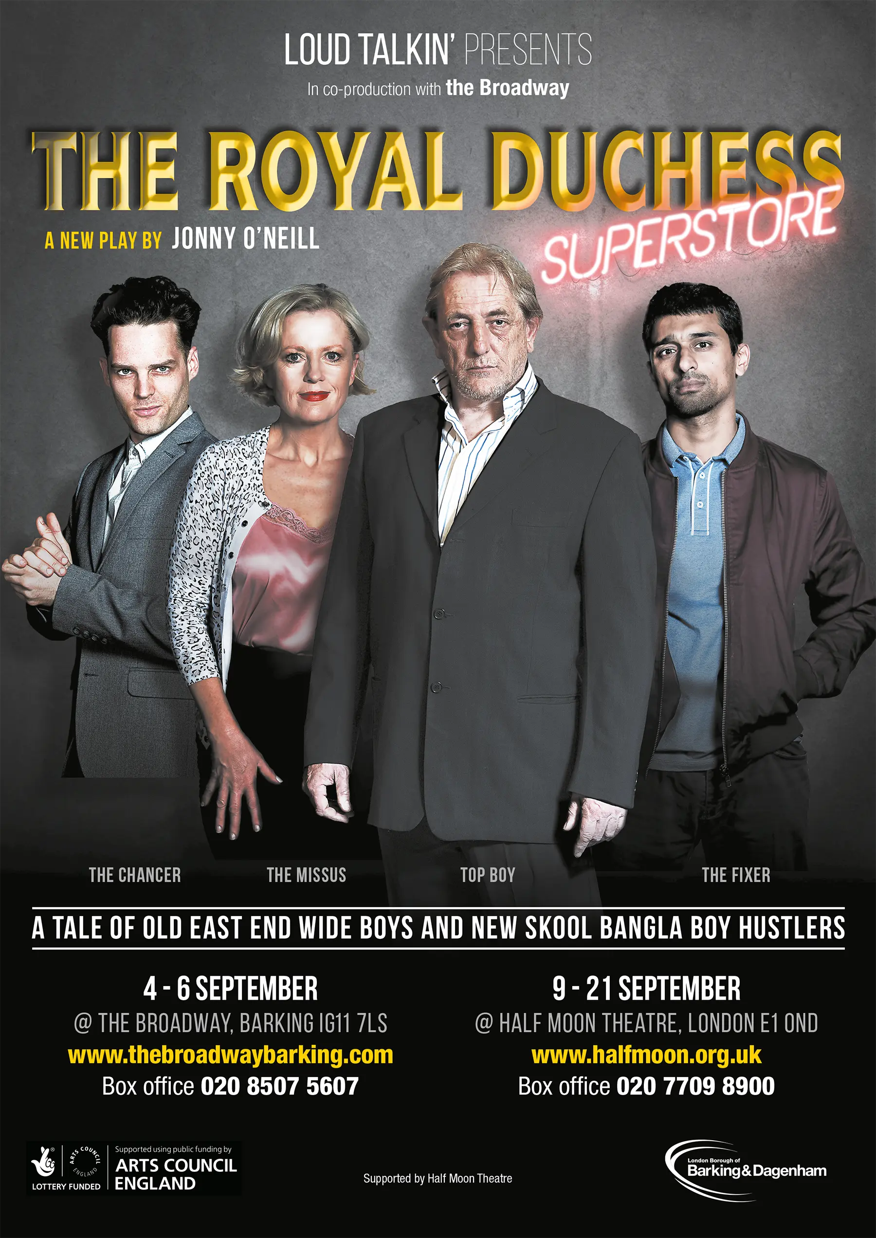
A slice of modern east end life at the Broadway theatre
The Broadway Theatre was staging the play The Royal Duchess Superstore which tells the story of Terry, recently returned to East London following a long stretch in prison, highlighting the changes that have taken place in his local area and Terry’s struggles to cope with his new environment, typified by the fate of his favourite pub, the Royal Duchess, which has become a corner shop.
We were asked to design a typographic title that captured the conflict between the old and new east end. We achieved this by the superimposition of the neon sign on the classic Victorian pub lettering to show how handcrafted signage is now superseded by contemporary technology.
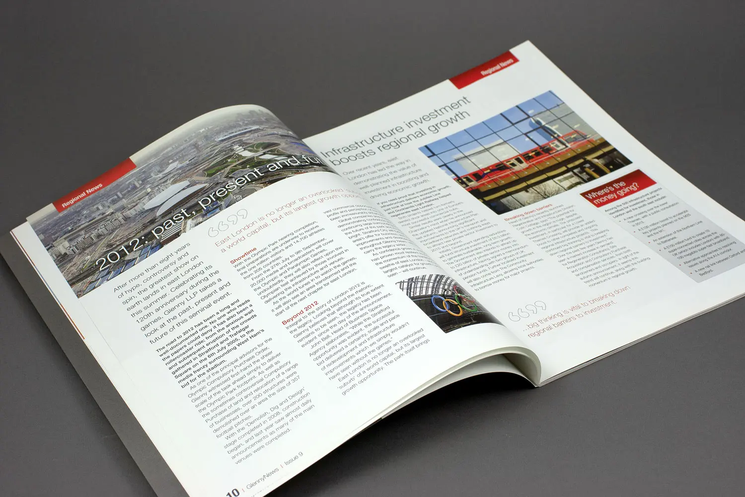
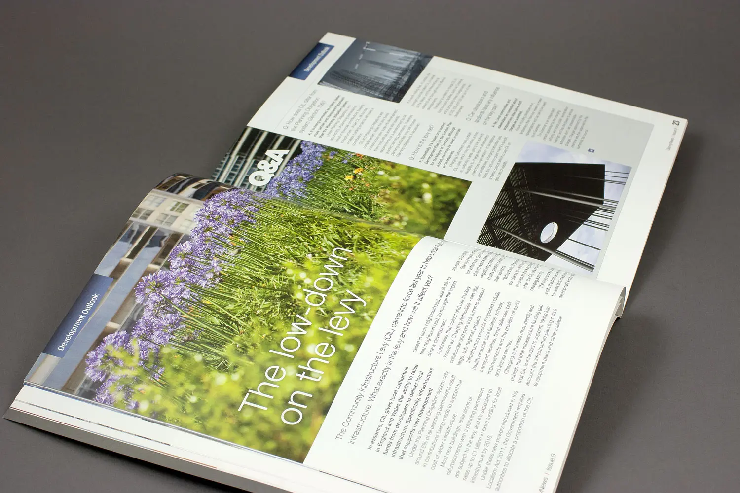
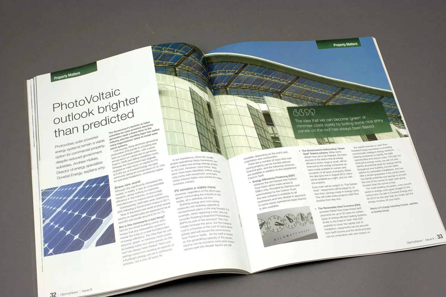
It was great news that we had won the tender against seven other agencies to redesign and print Glenny’s News magazine and their biannual databook.
They were particularly please that we would be saving them £20,000 per year against their current spend. Glenny News is a 64 page property magazine carrying regional news articles, development news and stories related to specific property matters. The back of the document contains advert listings for the properties they are currently marketing.
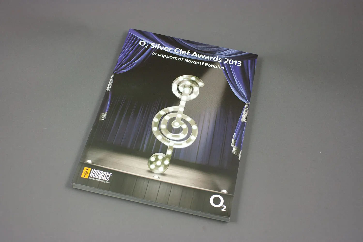
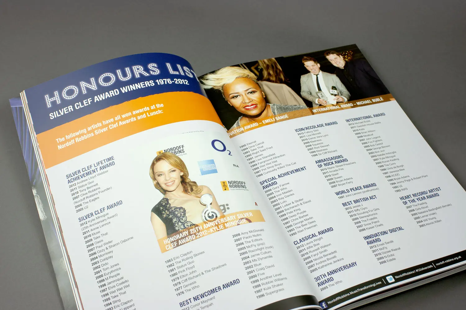
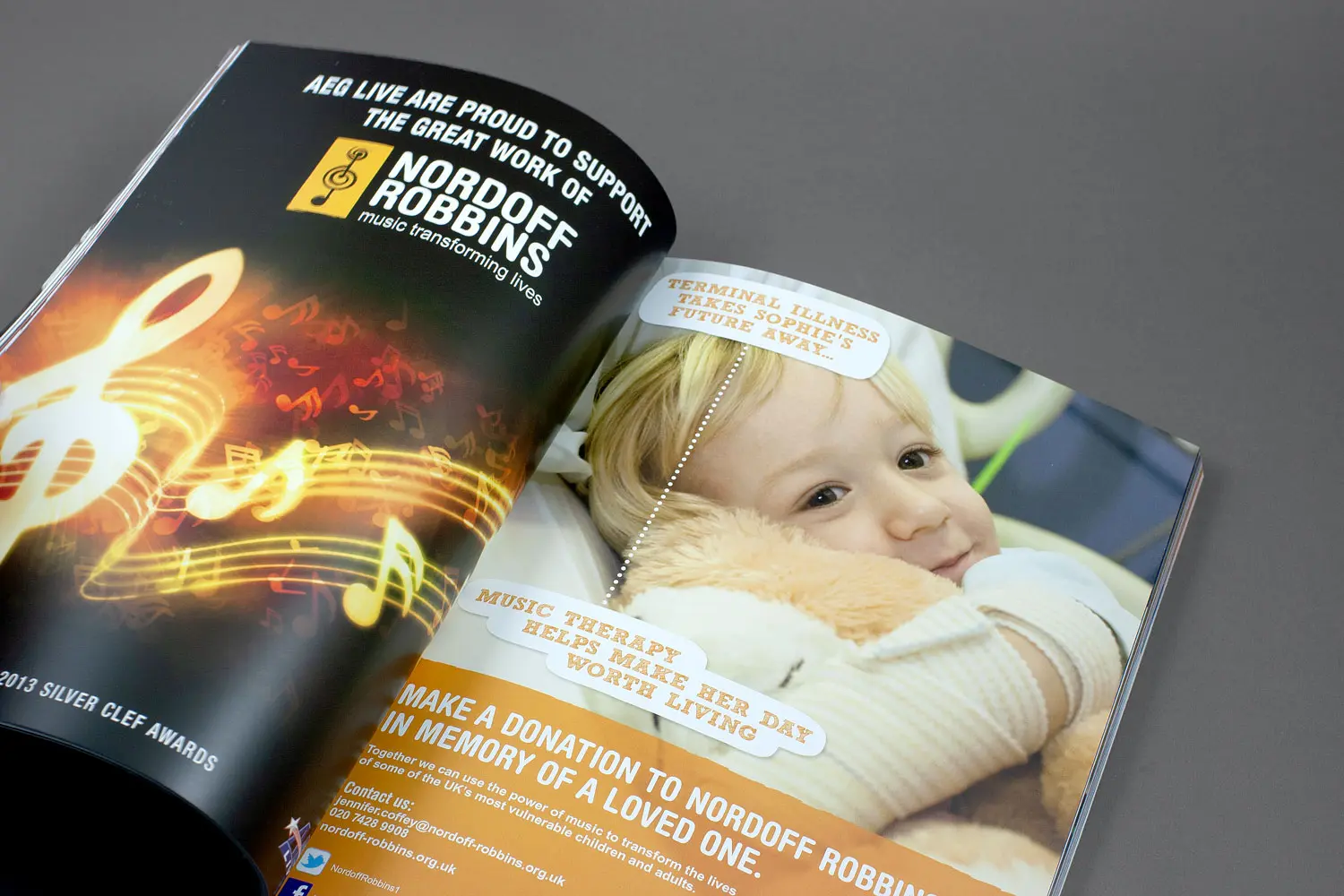
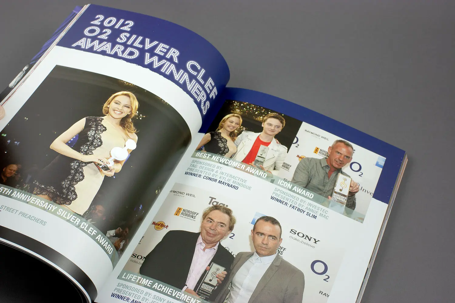
An interesting project came into the studio with the commission to design the prestigious awards program for the O2 Silver Clef Awards 2013 in support of Nordoff Robbins.
Nordoff Robbins is a major music industry charity working to transform lives through music therapy. Just about everyone who is anyone in the music industry gives their support to their worthy cause. This years event takes place at the London Hilton Hotel, Park Lane and along with an amazing awards ceremony they have an exciting auction of exclusive and one-off music related items. Check out their website to view the incredible work and see the highlights of the awards.
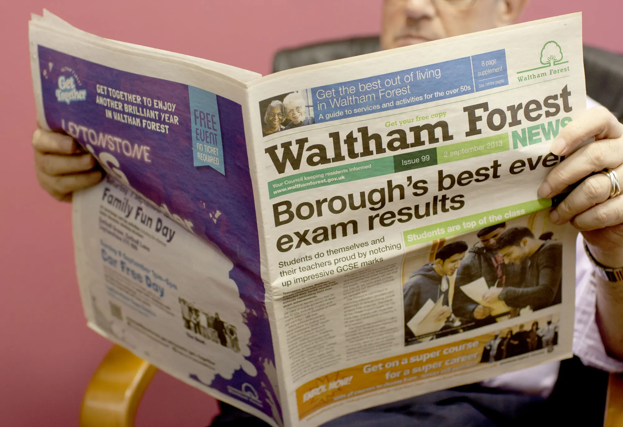
Waltham Forest Council commissioned us to redesign their fortnightly newspaper Waltham Forest News and re-work the layout structure to accommodate a greater number of shorter articles.
With a circulation of 115,000 copies distributed to every household in the borough the paper is widely read and so it was important to keep it identifiable to its regular readers. We created a fresh contemporary look to the paper without radically changing its identity and reinforced the style with comprehensive guidelines and a template with pre-styled layout elements.
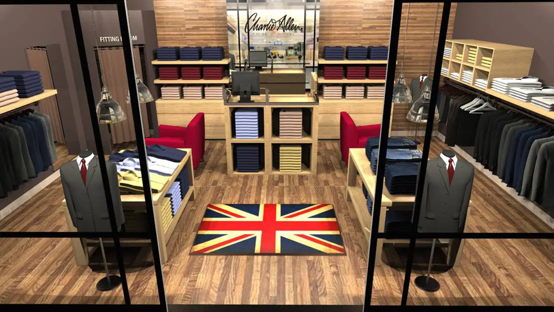
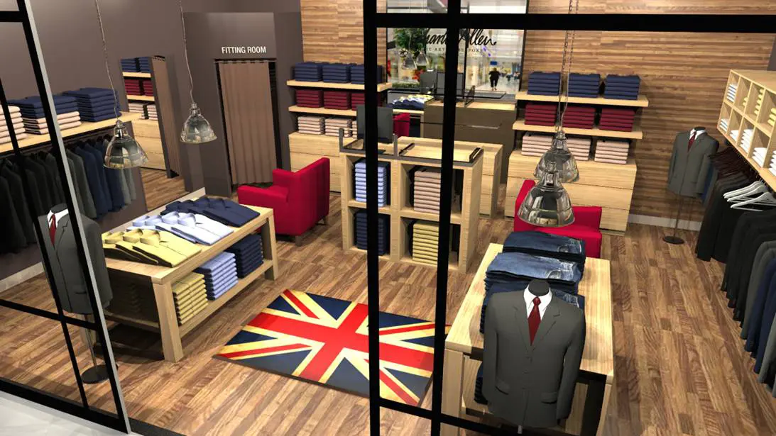
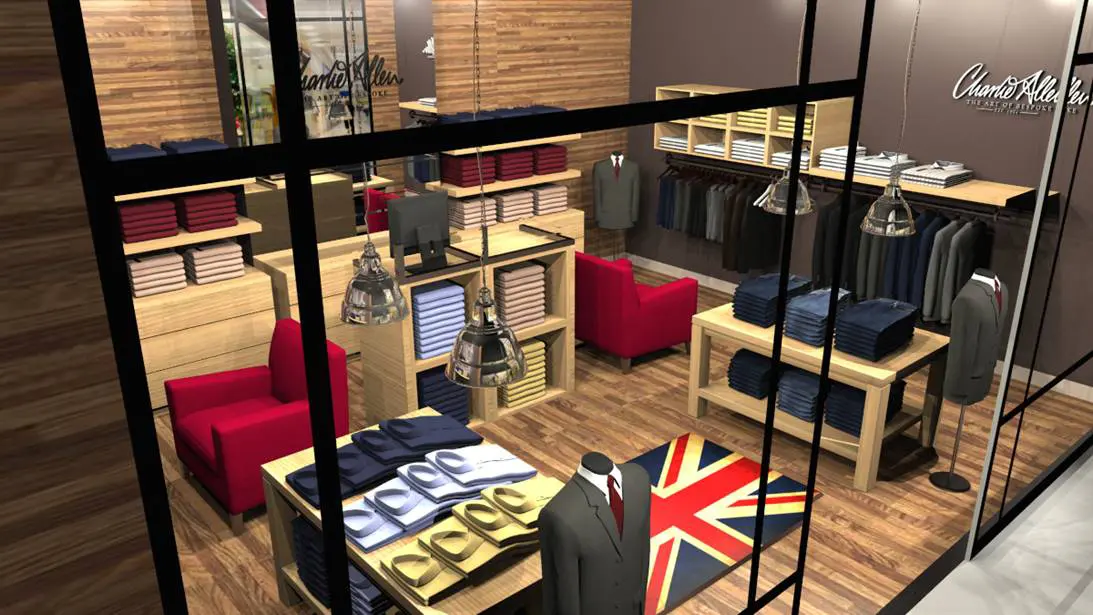
Charlie Allen, the renowned bespoke tailor was looking to launch his playful spin on Savile Row quality tailoring in Shanghai, China.
He came to us with his ideas of layout, materials and colours for the concession store and we mapped out the area. The store was then populated to it’s proportions and lighting and textures were added. 3D renders were created from several view points, output as prints and mounted onto presentation boards. If you’re looking for high quality menswear with a special touch of individuality you should take a look at the Charlie Allen website.
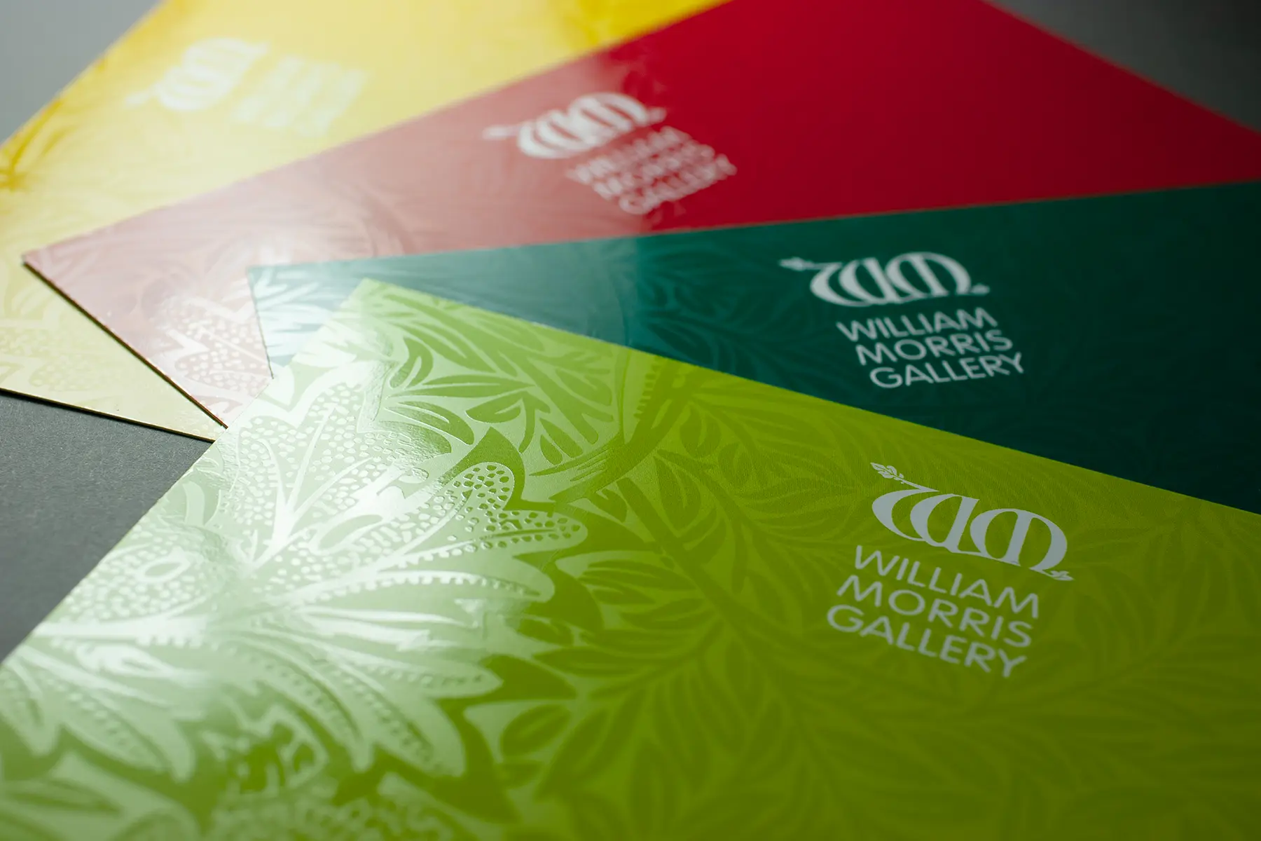
When the William Morris Gallery was awarded Arts Council funding to enlarge and renovate the gallery we were commissioned to create the launch invites as part of a whole brand refresh
The gala opening event was spread over four days to accommodate the number of guests with individual invites required for each day. A different colour from the palette was used to make the invites for each day easily identifiable. One of William Morris’s original designs was UV varnished over the solid colour creating a subtle and sophisticated appeal.
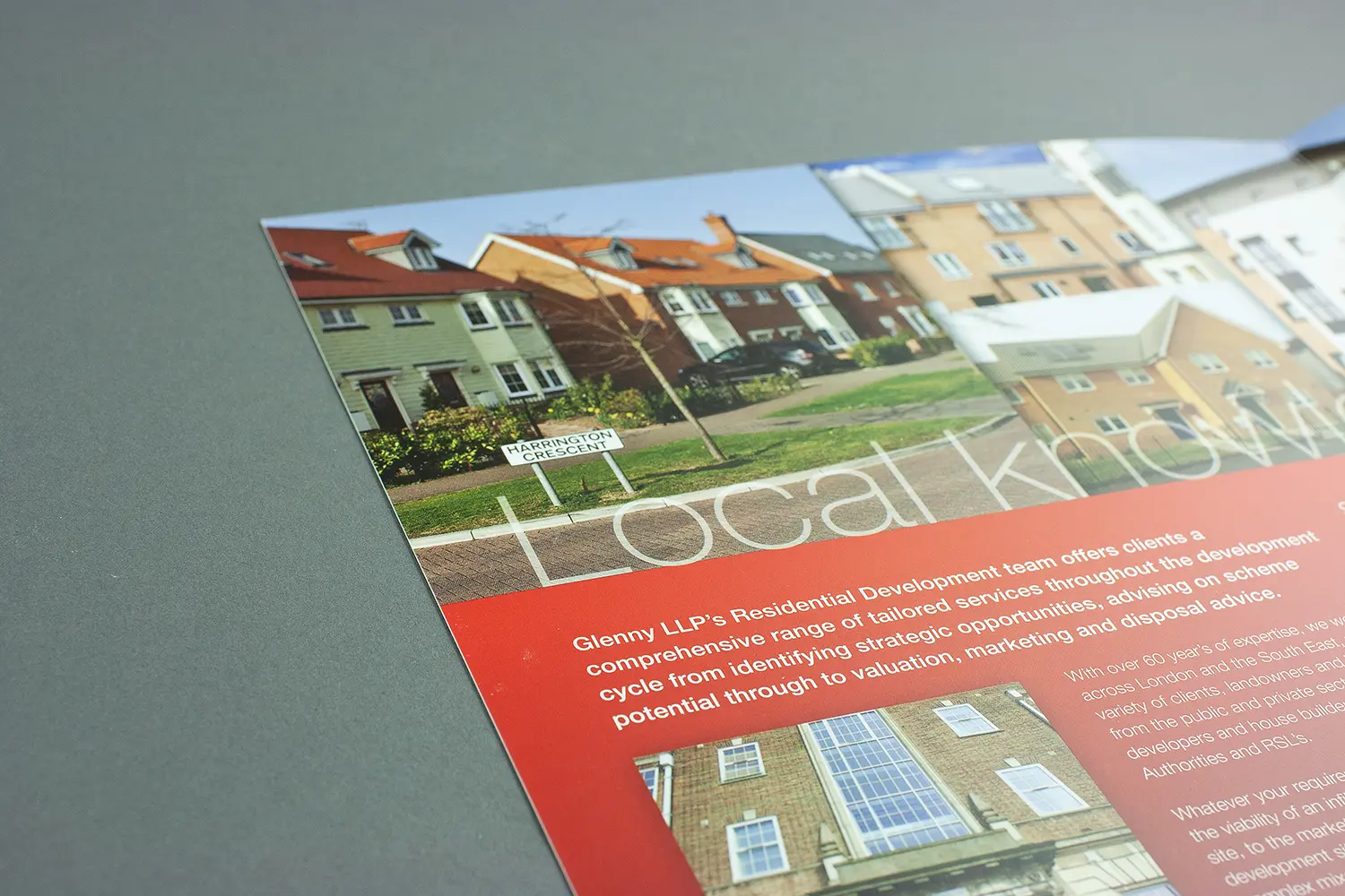
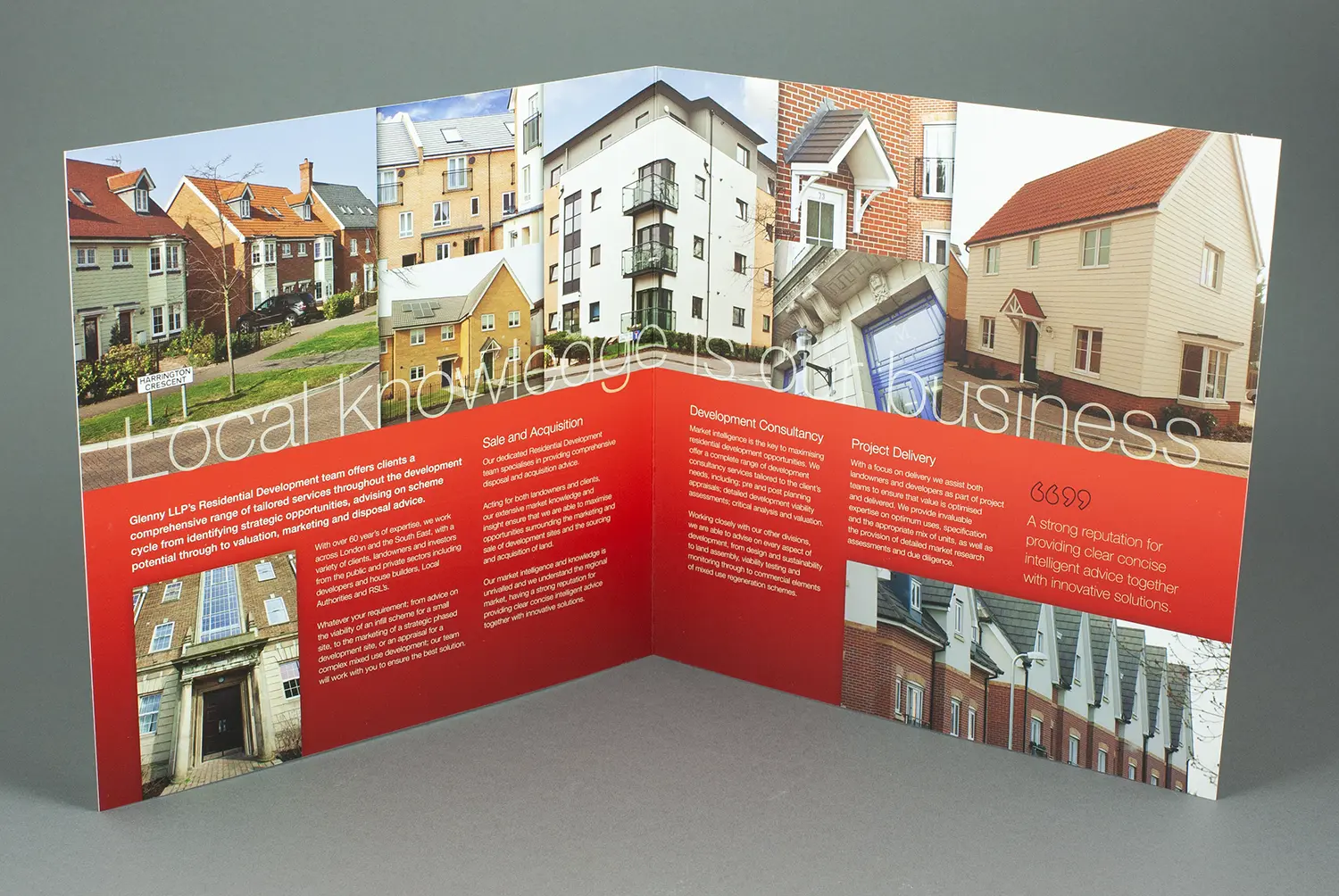
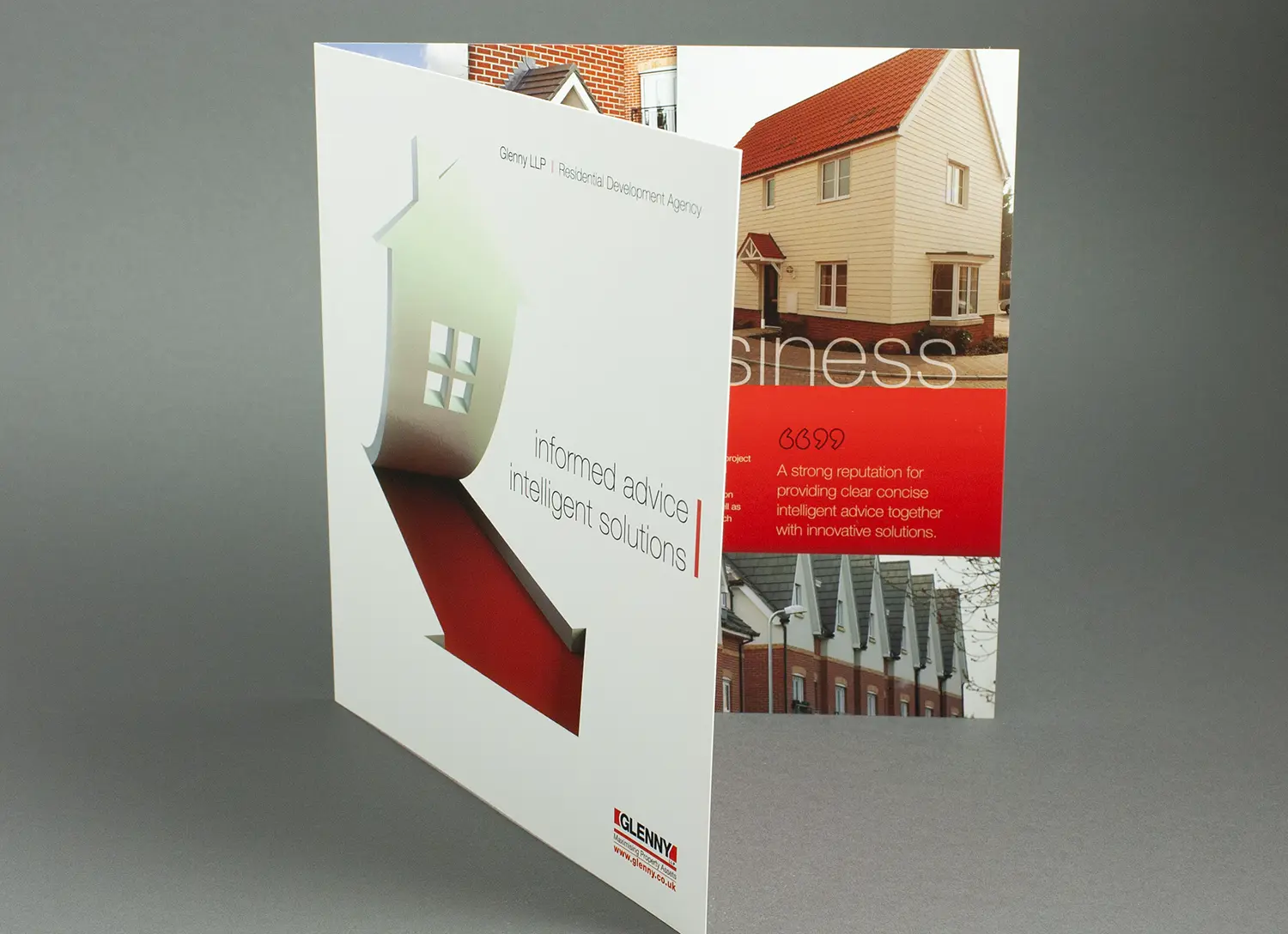
Glenny LLP were looking to reposition the offering of their residential development division with a new direct mail brochure to send out to developers.
Building on an existing house style, we were asked to design a document which raises the profile and highlights the comprehensive range of services of the division. To add an extra dimension the cover image was applied with a spot UV varnish.
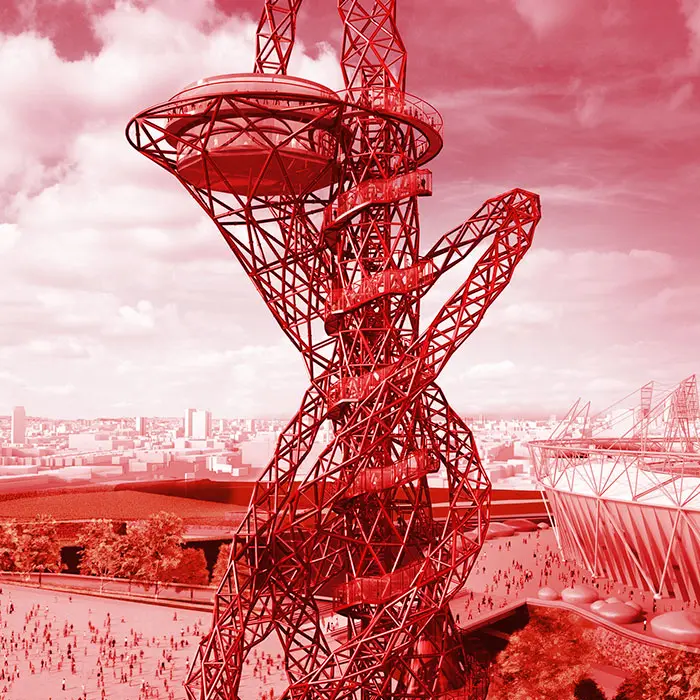
To celebrate the Olympic games coming to London again Tower Bridge Exhibition wanted to put on an exhibition in the West walkway to pay tribute the various cities that have held the games and highlight a few key stand-out moments.
We were very please to win the tender to design and produce the 30 panels which are on show from 2nd May to the end of the year. The images are from a mixture of royalty free and rights managed sources with the majority of the historic ones coming from Getty Images. The main focus of each panel was the host city and the brief also asked for a vibrancy of colour to reflect the rings and the dynamic energy of the competition to be brought into the design. We also arranged the content to be translated into 5 languages and incorporated them into the layout.
The property agents Glenny LLP celebrated 120 years in business this year
To mark this momentous milestone they invited some of their clients to a glamorous evening at the Aspers Casino in Westfield, Stratford. They asked us to create an invite suitable for the occasion and nothing adds glam like a lovely rich red foil, job done!
Every first and third quarter Glenny LLP publishes a statistical report outlining the sales and lettings performance within the commercial property sector
As the leading property consultants in the north east and south east sections of the M25 motorway the document is considered by many regeneration organisation as a key performance indicator for the overall market within the region. Building upon the current house style we redesigned the layout to promote a brighter user-friendly appearance and enhanced the graphs so key figures were emphasised.
We are very pleased to have won the tender for the “River Thames – Source to Sea’ exhibition for Tower Bridge
The commission was to design and produce 30 panels to be displayed along the 60 metre length of the west walkway.
The exhibition pays tribute to the River Thames through stunning photography illustrating the peace, power, beauty and historical significance of locations along the river from source to sea.
Receiving excellent reviews from ‘Time-Out’, ‘Metro’ and ‘The Wharf’ along with a substantial increase to their visitor numbers – we had a very happy client indeed.
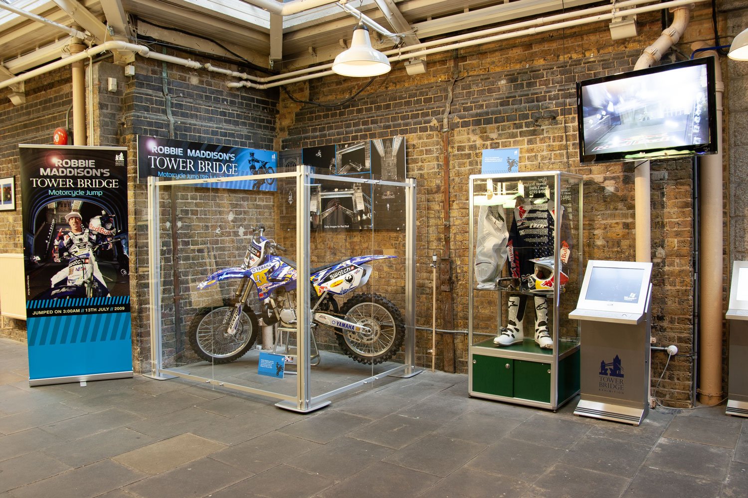
Motorcross stunt rider Robbie Maddison spectacularly jumped across the open bascules of Tower Bridge on his motorcycle and we were asked to design and produce display graphics for the exhibit.
At 3:00am on 13th July 2009 he performed a no-handed backflip before landing safely on the south side of the bridge.
The commission also included a new poster advertising the engine rooms (where the exhibit is displayed), a motorcycle themed seaside style photo booth and advertising posters to be displayed at the roadside.
Take a look at the video of the jump, it’s pretty amazing!