We’ve been working with the college helping them to produce their prospectus for over 20 years now.
This year we were tasked to come up with a design that conceptually portrayed the students progression and to make the prospectus stand out from the mass of other publications issued at the same time each year.
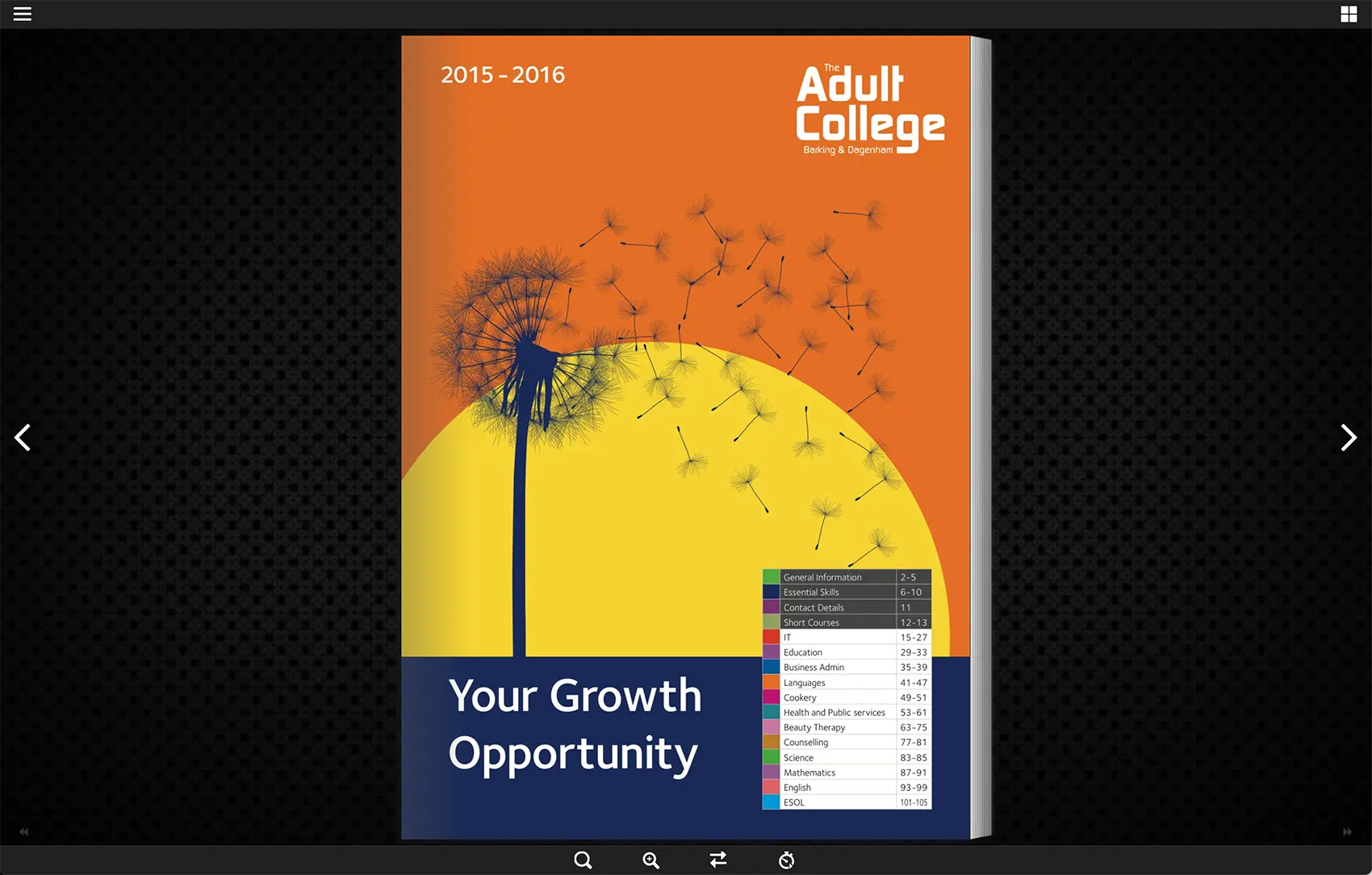
A dandelion made the perfect metaphor for the cover – the students learn together and when they complete the course they disperse and each apply their knowledge in pastures new. Creating a simple silhouette of the dandelion using only three striking colours produced just the distinctive look the client was hoping for.
The document was printed on uncoated stock to give a more tactile experience and this year was accompanied with an online page turner. The online version allows the viewer to browse the same as the physical version but also perform a search and print sections as required.